A Pushbutton with an Arrow
|
Home |
 |
Back To Tips Page |
|
A Pushbutton with an Arrow |
|
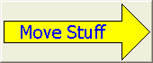
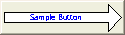
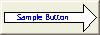
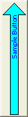
Every once in a while it is handy to have a pushbutton that contains an arrow. This is a handy little class I wrote that creates buttons with arrows, and also can include text:
This class incorporates the following features:
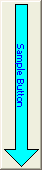
Buttons can point left, right, up, or down
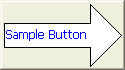
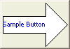
Text, if present, can be left-justified, centered, or right-justified.
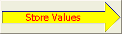
The line, body color, and text color can all be specified.
The text font can be specified.
The control will show as disabled when it is disabled.
The text size will dynamically adjust to fit the text into the arrow area.
This control uses existing styles and operations on buttons to achieve these capabilities.
The font is selected by using the normal SetFont calls on the control. However, the text height setting is ignored in all cases, and the font height is recomputed as necessary to cause the text to fit inside the arrow body. So the face name, italic, boldface, strikeout, and similar features are preserved, but the height is recomputed as needed.
The text area is limited to the rectangular portion of the bar of the arrow, and cannot flow into the head of the arrow. If no text is supplied, there is no attempt to display it.
The text can be set in the dialog editor as the Caption property or set at runtime using SetWindowText. If no text is supplied, no text will be displayed.
"Horizontal" orientation is all that is supported. The alignment is done along the line of the text, whether the text is running vertically or horizontally.
The alignment can be set at design time in the dialog editor, or at run time. To set the text alignment at runtime, the following can be used
c_Button.ModifyStyle(BS_LEFT | BS_RIGHT | BS_CENTER, desired_style_here);
The direction values are defined in DrawArrow.h, which is included by placing the following declaration in the header file for the dialog
#include "ArrowButton.h"
The method is
void CArrowButton::SetDirection(DrawArrow::Direction dir)
Inputs:
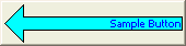
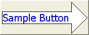
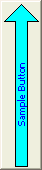
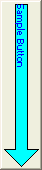
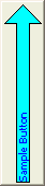
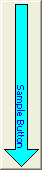
DrawArrow::Direction, one of DrawArrow::ARROW_N, ("North", upward pointing arrow), DrawArrow::ARROW_S, ("South", downward pointing arrow), DrawArrow::ARROW_E, ("East", right-pointing arrow) and DrawArrow::ARROW_W, ("West", left-pointing arrow).
void CArrowButton::SetLineColor(COLORREF color)
void CArrowButton::SetBodyColor(COLORREF color)
void CArrowButton::SetTextColor(COLORREF color)
COLORREF CArrowButton::GetLineColor()
COLORREF CArrowButton::GetBodyColor()
COLORREF CArrowButton::GetTextColor()
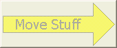
The usual EnableWindow call will work. A disabled button will print out with a grayed-out background and ::GetSysColor(COLOR_GRAYTEXT) for the text color.
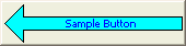
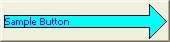
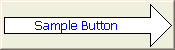
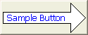
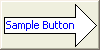
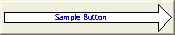
| DrawArrow::ARROW_E | DrawArrow::ARROW_W | DrawArrow::ARROW_S | DrawArrow::ARROW_N |
 |
 |
|
|
| BS_CENTER | BS_CENTER | BS_CENTER | BS_CENTER |
 |
 |
|
|
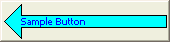
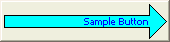
| BS_LEFT | BS_LEFT | BS_LEFT | BS_LEFT |
 |
 |
|
|
| BS_RIGHT | BS_RIGHT | BS_RIGHT | BS_RIGHT |
|
|
|
| Enabled | Disabled |
The text size is adjusted to try to maximize the height, but if the consequence of maximizing the height is that it would be too long for the text area, the size is recomputed
 |
 |
 |
| 175 ×70 | 125 × 70 | 100 × 70 |
 |
 |
 |
| 175 × 50 | 125 × 50 | 100 × 50 |
 |
 |
 |
| 175 × 35 | 125 × 35 high | 100 × 35 |
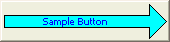
I have used variants of this control in several other programs, including my Viewport Explorer, Floating Point Explorer, and Locale Explorer. However, this code was developed from those original sketches for another purpose, and is much more elaborate.
The modules that constitte the drawing are the following
ArrowButton.h |
Defines the class CArrowButton |
ArrowButton.cpp |
Implements the CArrowButton class. This includes the logic to draw the button and the dynamic text resizing logic. |
DrawArrow.h |
Defines the drawing routine interface. This is included by including ArrowButton.h. |
DrawArrow.cpp |
Contains the drawing logic for the arrow. This logic does not include the font-adjustment logic, which is part of the button control logic. |
To debug this class, I wrote a driver program that would allow me to test all the various combinations.
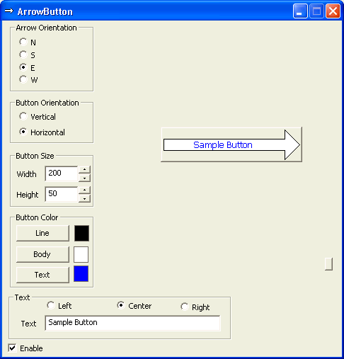 |
Arrow Orientation: The N, S, E and W values choose the appropriate DrawArrow::ARROW_x value for CArrowButton::SetDirection. Button Orientation: This is just a quick way to exchange the Width and Height values. Button Size: This establishes the size in pixels of the width and height. Button Color: This allows you to set the colors used for CArrowButton::SetLineColor, CArrowButton::SetBodyColor and CArrowButton::SetTextColor. Text: This creates a caption for the body, and selects the alignment BS_LEFT, BS_CENTER, or BS_RIGHT. Enable: This enables or disables the control. The sample button itself is shown in the top right quadrant. It is constrained to not exceed a specific area of the screen. The tiny unlabeled button on the far right copies the button image to the clipboard, and that was how all the illustrations for this page were created.
|

![[Dividing Line Image]](div.gif)
The views expressed in these essays are those of the author, and in no way represent, nor are they endorsed by, Microsoft.