
The Bush "Guard memos" are forgeries!
Additional Information
| Home | |
 |
Resume |
|
|
|
The Bush "Guard memos" are forgeries!Additional Information |
|
| UPDATE HISTORY | |
| 12-Sep-04 | Kerning and pseudo-kerning. Digital signature copying. |
| 13-Sep-04 | Varityper |
| 13-Sep-04 | Comparison of numeric 1 and lower-case L |
| 15-Sep-04 | The Selectric Meltdown |
| 17-Sep-04 | More about the Selectric Meltdown; Pixelization |
| 18-Sep-04 | The IBM Executive Typewriter; Chain of custody; Records retention cycles |
| 3-Oct-04 | The Hailey Connection |
| 10-Oct-04 | The New York Times Font |
| 20-Oct-04 | Some personal reflections on this whole experience. |
| 11-Jan-05 | The Columbia Journalism Review |
| 11-Jan-05 | Hailey's response to my work |
I have been receiving emails (nearly 600 at this point), many of which were asking specific questions, some pointing out "failures" in my analysis (such as the failure to take into account the IBM Executive Typewriter or the Selectric Composer). This supplement is a collection of responses to both technical issues and several non-technical issues that were raised.
One of the key things I have tried to do in my presentations is make sure that every detail is visible, so that others could replicate my work. I have done additional analysis, and the posting of this page was delayed by my need to meet other commitments, including a week of teaching.
There have been many responses by those who are playing the part of the defense. Alas, they seem to not understand the real issue. For a huge number of the messages sent to me, they essentially boil down to "I once heard that there was a typewriter-like device that was capable of variable-pitch fonts, and therefore this document could have come from the 1970s". Yet those who actually have seen, used, or currently possess such devices seem unable to demonstrate that such an exact match can be created. Wishful thinking and hearsay do not make a good defense case. Others have raised very minor objections, such as the poor pixel quality of the CBS memos as masking significant differences. Going into a full treatise on aliasing, anti-aliasing algorithms, image thresholding, pixel quantization, etc. is something I have tried to avoid, although it became clear that this is so mysterious to some of my correspondents who cite such issues (all of whom are on the defense side) that it became clear I had to say more than most people needed to know, to establish that I actually have a case, and that my analysis still holds. I know a lot more about these topics than I've put down here, and yet I don't know nearly as much as serious image processing experts. But you don't need to be a brain surgeon to look at an arm bent 45º between the elbow and the wrist, and declare the arm to be broken.
|
Arranged by IBM Selectric Composer Character Widths Note that if Times New Roman were consistent with the IBM Selectric Composer, all the colors in each TNR column would be the same! But we see a multicolored column for each character spacing, showing the relative spacings of Times New Roman and the IBM Selectric Composer are incompatible. |
|||||||||||||
| Characters which appear in the 18-Aug-73 memo | |||||||||||||
| 3 | 4 | 5 | 6 | 7 | 8 | 9 | |||||||
| char | TNR | char | TNR | char | TNR | char | TNR | char | TNR | char | TNR | char | TNR |
| ' | 2 | : | 3 | a | 6 | 1-9 | 6 | B | 8 | A | 10 | M | 12 |
| i | 3 | f | 4 | c | 6 | b | 7 | C | 8 | G | 8 | m | 9 |
| j | 3 | I | 4 | e | 6 | d | 7 | E | 7 | H | 9 | ||
| . | 3 | r | 4 | g | 7 | h | 7 | F | 7 | O | 9 | ||
| s | 6 | v | 7 | k | 6 | T | 8 | R | 8 | ||||
| t | 4 | J | 5 | n | 7 | U | 9 | ||||||
| o | 7 | w | 9 | ||||||||||
| p | 7 | Y | 8 | ||||||||||
| S | 7 | ||||||||||||
| u | 7 | ||||||||||||
| y | 7 | ||||||||||||
|
Characters which do not appear in the 18-Aug-73 memo |
|||||||||||||
| l |
3 |
; | 4 | z | 5 | q | 7 | L | 7 | D | 9 | W |
13 |
| ` | 4 | ( | 4 | ? | 6 | x | 5 | Z | 8 | K | 9 | ||
| ´ | 4 | ) | 4 | [ | 4 | P | 7 | N | 9 | ||||
| - | 4 | ! | 4 | * | 7 | Q | 9 | ||||||
| / | 4 | $ | 6 | V | 8 | ||||||||
| + | 7 | X | 9 | ||||||||||
| = | 7 | Y | 8 | ||||||||||
| ] | 4 | & | 10 | ||||||||||
| % | 11 | ||||||||||||
| @ | 12 | ||||||||||||
| ¾ | 10 | ||||||||||||
| ½ | 10 | ||||||||||||
| ¼ | 10 | ||||||||||||
| _ | 7 | ||||||||||||
This is a supplement to my discussion in my earlier Web page, showing that the Selectric Composer could not have produced the CBS documents. Several correspondents still insisted that the Selectric Composer could have produced the memos (in spite of the fact that the existence of such a device in the TANG offices is denied). This table shows that the fonts on the Selectric Composer and the fonts found in the memo are completely incompatible when viewed in the context of creating the entire document, even if superficially certain letters when printed by the Selectric Composer resemble corresponding letters of Times New Roman. If you do not believe the Selectric Composer is even an issue, you may skip to the next section.
The accompanying table demonstrates the inconsistencies between the character widths of Times New Roman and the Selectric Composer characters. As previously discussed, the units are not really adequate for doing a straight comparison, because the fonts are based on different coordinate systems.
I started with the Selectric Composer Character Unit Value chart that one of my correspondents emailed me a link to. I retyped it here based on the "by unit value" part of the table. I added some colors, which I'll discuss shortly. Then for each character, I added a second column TNR for the width my Font Explorer reveals for Times New Roman, 10 point.
Remember that above I explained that the "width" of fonts is based on some abstract measurement of the character, so it makes no sense to say that a "4-unit" character on the Selectric Composer should be the same as a "4-unit" character in Times New Roman. But we would expect to see a consistency. So if we have a "6-unit" Selectric Composer character, we could see that it is represented by, say, a "7-unit" Times New Roman font. But look at the 6-unit table. We find that the TNR font widths vary from 4 (for the "]" character to 7. So if we expected to see a consistency between Selectric Composer layout and Times New Roman layout, we would have to see a consistent set of character widths. If we had perfect layout correspondence, each column would have a TNR colum which was all the same color, although that color would not necessarily match the color of the top of the table. It should be consistently different. But we don't see that.
I took the font table at the link given, and split it up into two sub-tables. The upper table actually lists the character widths of the characters used in the memo dated 18-Aug-73. The lower table shows most of the rest of the table. None of these characters appeared in the 18-Aug-73 memo. But the discrepancies are worth noting.
This is a visual clue to why when we look at the experiment done by Jeff Harrell, with the cooperation of Gerry Kaplan of www.ibmcomposer.org, we see that the text does not line up horizontally. It also does not line up vertically, which is yet another problem. You should go check out those sites, which offer some compelling evidence that the IBM Composer could not have been used.
This does not mean that an experienced operator could not, with some clever use of spacing, get the space to line up. But remember we are talking about memos claimed to have been typed by Killian himself, a person who is said to have never typed anything. In a CBS interview, his secretary claimed that she never typed the documents in question, and that he wrote out all his memos longhand and she typed them up for him. Is there something inconsistent between her statement and the hypothesis that he typed these himself?
Generally, Knox said Killian was anxious about creating a paper trail at the Guard base, and kept copies of his correspondence, which he would write out longhand and give her to type. (From the CBS interview)
So who did type them? My data leads me to suspect that it was someone in the last few years, if not in the last few weeks.
In the experiment using the Selectric Composer, Jeff also points out that switching fonts to 8-pt involved several elaborate actions on the part of the typist, including changing the typeball and what I interpret as a font-size lever. Not to mention doing a partial-scroll of the platen (does anyone remember what a platen was?). The likelihood that an inexperienced typist would choose to do this for any memo is vanishingly small. But there's more. Apparently if this is not done perfectly, there is a horizontal misalignment of the superscript. Yet a close examination of the typography of the CBS documents shows that the "th" is always perfectly aligned when it appears, tucked up nicely against the digit. No accidental inconsistencies caused by the reported slippage. Not once, not in any memo. This, too, stretches credibility. Oh yes, when the platen is rolled back, somehow it is a perfect rollback, because we see no vertical misalignment. Yes, I know that some of the more rabid opponents will want to point out several artifacts, so let me explain them. And as I mentioned, look carefully at the placement of the "th", horizontally, and read the discussion about the slippage. Note that the alignment of every superscripted "th" is perfect, within the limits of the quantization (see below). In fact, it is so good that the quantization does not seem to make much difference!

We do not have an original document here. We have a scanned image of a fax transmittal. Note that the serif of the "R", the bottom serifs of the "1" digits, the period following the "I", perhaps the initial "a" of administrative, all seem to be "below" the line I drew. The "v" of "administrative", on the other hand, appears to be slightly above the line. The argument that might be presented is that the inherent type misalignment of a real typewriter could cause this. I am more inclined to say that these are artifacts of the scanning process. A key example here is the appearance of the two letters "a" in "administrative". One appears to have a bit that drops below the line, and a flatter top; the other appears to have a rounder top, and be slightly above the line. The serif on the "a" is also slightly different on the two. If the "a" were misaligned on a real typewriter, we should see a consistent misalignment, vertically or horizontally.
But within the limits of experimental measurement, we have a pretty straight line. This suggests a great deal of skill in making sure the platen set properly in its detent when it was scrolled back. There is not a systematic discontinuity. There are several possible explanations for this. The most credible is simply that the Selectric Composer was a very well-designed piece of equipment and such an error would not have occurred, even with an unskilled operator. This is probably the most credible one. But would this be true with an ordinary typewriter? I'd have to do calibrated experiments on real typewriters to determine if this is so. But one of my correspondents developed the CE (that's Customer Engineer) manual for an IBM typewriter division, and he said that type misalignment was a constant problem. Special tools were used to realign the type. As typewriters age, their type goes out of alignment. I remember one TV program (probably a movie) I saw, in which a horde of FBI agents come into an office and start down through the typing pool, typing the text of a ransom note on each typewriter in turn. They were looking for a typewriter with the same inconsistencies as the ransom note (they found it, as I recall). We see a surprising consistency in these documents, even taking into account all of the scanning artifacts. Only a careful study of the original documents could confirm this, but this would also reveal the type of device on which the originals were printed. Film ribbon, cloth ribbon, etc., ink chemistry, and the like all will say something about the nature of the device that produced it. I strongly suspect the original is printed in little tiny spots of ink, or laser toner. But there's a lot of consistency in what we are seeing in the scanned images. I have heard reports that it is too good to be true, but I have not taken the time to do such detailed examination on a character-by-character-pair basis, but it does not surprise me that when I do my experiment printing my version on transparency and placing it over the original, I do not see any artifacts that I would expect if a typewriter with possible horizontal or vertical alignment errors were used. I might expect to see every "a" misaligned up, down, left or right, but instead I see such a perfect alignment of every letter of my copy with every letter of the CBS version, with no such errors, that I believe strongly that this was typed on a perfectly-aligned typewriter. And that the normal wear and tear which would cause alignment to drift either did not occur in the months between the memos (unlikely), or the typewriters were just by coincidence freshly-realigned right before each memo was typed. And absolutely no errors were made in the alignment, so every memo is absolutely perfect. This stretches my belief system too much. Or, as an alternative hypothesis, the output was printed on an inkjet or laser printer, so the perfection is what is expected.
There are some interesting problems in analyzing the documents, because they are a bad rendering of a fax, which is itself a bad rendering of a document, which is said to be a copy itself of the original. The anomalies observed hinge on a phenomenon known as “pixel quantization”, where features whose detail is close to the resolution of the printing device (in this case, a fax machine) can be distorted. Typical distortions are either doubling or disappearing of fine features, in this case, serifs and edges in general. It can also result in artifacts that appear to be off-by-one such as above the baseline of the text or below. When analyzing for such artifacts, the key is to look for repetition.
In scanning, there are quantization effects based on the fact that the sensors of a scanner or fax machine can represent only discrete units on the image. A sensor that is scanning a black-and-white area under that single sensor can declare the pixel to be one of some limited number of values, which is somehow an average of the black value and the white value. A two-level (monochrome) system will declare the pixel to be either black, or white, but not gray. Other devices, for example, a grayscale scanner, could reduce the intensity to 4 (2-bit), 16 (4-bit), 32 (5-bit), 64 (6-bit), 128 (7-bit) or 256 (8-bit) levels of gray (for example). These transformations are hardly ever linear, that is, in an 8-bit scanner, nominally delivering 256 levels of grayscale, there may actually be only 64 distinguished values, represented as 0, 4, 8, 12, 16, etc. And there may be more discrimination between levels of gray than levels of black. Or it could be worse. These transformations, if they do not precisely reflect the actual level, can be referred to as "non-linear" response values. Then, when the fax printer prints it, it applies a halftoning algorithm to attempt to generate an illusion of grayness (that speckled background you see is an example of this phenomenon). Then this poor-quality document was most likely scanned back in, and my screen and printer also do approximations. My printer is fairly limited in that it can only print black or white pixels. So what we call "edge effects" can be misleading. Without a good optical-resolution scan of the original, such artifacts can be misleading. We also have to take into account possible misalignments of the sensors, relative to a perfectly straight line, quantization caused by rotation (note that the line "Report to 111th F.I.S. administrative" is at a slope, meaning the image line was at an angle to the sensor array. So there are additional artifacts.
The term for this phenomenon is "pixel quantization" or "pixelization".
On a typewriter, an error in a character would be consistent, because the type bar (or type ball) is uniformly misaligned, whereas on a faxed document, the anomalies will appear on some lines and not others. It is also the case that if the document is not perfectly straight when faxed (and I mean REALLY straight; an error of half-a-fax-scan is serious, and a fax sends typically 100 dots per inch (dpi), so a misalignment of 1/200 of an inch, which is 5/1000 of an inch, introduces pixel quantization artifacts along the length of the line (the reason for the half-size error relates back to what is referred to as the Nyquist Limit, which deals with “aliasing” of signals caused by sampling a signal at a frequency close to half its wavelength; an analogous problem occurs when sampling a feature at a resolution more than half its dimension). It is clear from examining the CBS documents that there was a significant rotational misalignment, which means that there are additional artifacts. What is amazing to me is that even when these artifacts are taken into account, the correspondence (for example, I’ve blown up "187th" to full-page-size and compared it to a similar full-page-size of a scanned high-resolution Word document) is far too good. In addition, because a fax machine normally transmits the paper vertically, slight irregularities in the feed mechanism, again, at the 5/1000 of an inch level, can distort fine detail, particularly when that detail (such as serifs and top and bottom edges) is close to the resolution. So when we take something that is misaligned, and make a 5/1000 inch error in the rate at which it passes over the sensors, we can lose significant parts of fine detail. So I can say with a fair degree of confidence that these pixel quantization effects account for the anomalies you observed.
For those who need a comparison, a human hair is typically about 3/1000 of an inch, so an alignment error or feed irregularity error of less than two hair-widths can produce scanning artifacts due to pixel quantization at 100dpi. If the image was scanned at 150dpi or 200dpi, the errors that can produce pixel quantization errors are correspondingly smaller. For example, at 150dpi, each pixel is 6.6/1000 of an inch, and the half-pixel size is 3.3/1000 of an inch, the approximate thickness of a human hair. At 200dpi, the pixel size is 5/1000 of an inch, and the half-pixel size is 2.5/1000 of an inch. However, my first estimate is that this was probably scanned at 100dpi. [Note: after writing this section, I performed some additional research, which tends to confirm that the actual fax transmittal resolution was 150dpi, so quite small errors will result in pixel quantization].
There are other issues that bother me. When I learned to type, I was taught to leave two spaces after a period that ended a sentence. Decades of working on word processors, where the variable-pitch font makes such double-spacing look a bit clunky, have largely broken me of that habit. Yet Killian, a non-typist, puts two spaces after each period (with a couple of exceptions), just as a trained typist would do. This is a question to explore: did he not type because he didn't know how, or because he chose not to? (In my first attempt to duplicate the CYA memo, my error was that I put one space after the periods and had to insert extra spaces to get the text to line up. But it was then just an issue of following the standard typing practice). I am not following the non-font issues closely enough to know if this question has already been answered, but in looking at the document, my impression is that it was typed by someone who is a "classically trained" typist. This seems inconsistent with the descriptions I have read describing Killian as a non-typist.
I have been quoted in a remark I made in one of my radio interviews, that the forgery was "inept". There are may reasons I made this statement. The presence of a variable-pitch font was immediately suspect. The presence of the superscripts that looked just like what Word does was suspect. The places where the superscripts do not appear tend to be places where the forger, not knowing how to use Word, did not know about Ctrl+Z to undo the automatic transformations, but instead put spaces in front of the ordinal marker to inhibit the automatic transformation, and I speculate that this was with the intent of going back and removing the spaces. However, he (I'm assuming it is a he, for a variety of non-sexist reasons) messed up, having forgotten to defeat it in some cases, and in other cases forgetting to go back and remove the spaces.
Everyone has had a laugh at the "expert" CBS hired, who claims that some complex and elaborate protocol would have been required to enable and disable the auto-superscripting. Had the forger, or the CBS "expert", known anything at all about how to use Word, this would not have been an issue even worthy of discussion. The forger would have simply disabled it entirely. There would have been no need to re-enable it. The inconsistent appearance of superscripting, the spaces before the superscripts, and the near-perfect match of the superscripts shown in the CBS documents with output from my laser printer is astonishing. So in looking at the inconsistencies, I am led to the conclusion that the forger was an amateur.
In another illustration of the amazing similarity of this document with Word output, I took the two 187th illustrations that appear in this page, and printed them in a mode that expanded them to fill a page. I printed the laser printer output on paper and the CBS document on a transparency. You can overlay one page on top of the other, and modulo the scanning and faxing artifacts there is a perfect match. Not just sort-of-close; I mean dead-on close. If you have a picture program, you can right-click on those images, do a "save image as", save the image, and do the experiment yourself.
One correspondent pointed me at a site which proves I have been debunked. Here is my counter-claim. As in all my evidence, you may examine both claims and reach your own conclusion, but I believe that this confirms my initial analysis. And remember, anyone can make this same comparison with commonly-available computer technology!
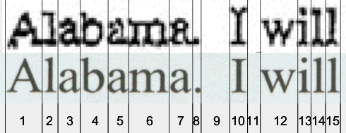
The top is from the TIFF image of the CBS memo; the bottom from a scanned image from Word. (By the way, thanks the the correspondent who pointed out that I could directly export the TIFF image from Acrobat. I am an expert in many things, but Acrobat export was not one of them. You know who you are, so thanks!). The claim that I am wrong is based on the fact that the serifs on the L and I in the top appear to be flat, but the serifs in the bottom are not.
Go back and read my description of edge effects and quantization. Note that the lower case Ls in "will" not only appear to have flat serifs, but the bottoms of the lower case Ls, the serifs of the lower-case i in "will", the serifs at the bottom of the "m", and even the serif on the initial "A" all appear to have slight distortion. But the Big Picture is so incredibly close it is hard to imagine that there was much difference. The criticism is sort of like a fingerprint expert pointing out the similarities of the fingerprints found at the crime scene and the fingerprints of the accused, and being told that when two areas of the fingerprints, perhaps a section a millimeter square, are just a bit different, and therefore, by conclusion, the fingerprints could not possibly be the same. The only valid counter to this I could consider is if someone comes to me with a sample of actual typewriter output, produced on a 1972-vintage typewriter, without any special effort to do any form of manual kerning, and show a feature correspondence as close as the one I show here. If anyone can send me such a document, I will scan it or take the scanned image you send me and paste it into this comparison.
Useful artifacts of this to study are the interesting white gap between "b" and "a" (artifacts 4 and 5); even in the poor resolution CBS scan we see that the spacing between these two letters is unlike the spacing between any other letters, which appear to be tucked up tight against each other.
A number of people have asked me to address the centered-letterhead issue. I did not feel I needed to, because it is addressed so well at Jeff Harrell's site. He did an excellent analysis. While the results did not surprise anyone who already assumed a Word forgery, his presentation certainly appears to me to be evidence-quality-for-court-of-law work.
Testimony by Killian's secretary claims that such typewriters were apparently not available. I have not been able to locate any type samples of the Selectric Model C or D for close enough examination; the only samples I have found on the Internet are of such low quality as to make any conclusions about the similarity questionable. While my visual inspection of the document shown in an IBM ad of 1954 look suspiciously like there is no negative kerning under the "f", I cannot trust my visual impressions of such a low-resolution photograph. If anyone has such a typewriter, I'd love to get a copy of your impression of the Bush memo done on one of those machines. Contact me by email for how to get it to me. My first estimate is that there was no such kerning as we see, but that impression cannot be substantiated by the samples currently available to me. Update: See below!
Many people do not know that the paper size used by the Department of Defense (DoD) for many, many years was 8×10½. As copiers became more and more important, the cost of producing a ream of paper plummeted. When I was buying typing paper, which I bought by the ream when I was in college, it cost a fortune, I think I was paying $5 or $6 a ream, in 1963-1967 dollars. Today I buy paper by the case, and pay about $2.50/ream in 2004 dollars, and less than that if I get one of the Office Depot 2-for-1 or 3-for-2 specials. So if we take various postulated multiples of the adjusted dollar cost (which I have not confirmed but seem to be about a factor of 4 or 5) I can now buy a case of paper for what would be the adjusted 1966 cost of a ream of paper. The cost of buying the custom paper size was becoming a dominant cost to the government. But an additional problem arose because DoD then required this form factor in all their "support peripherals". Everything matched 8×10½. File cabinets. File drawers in desks. File folders. Pendaflex and similar folders. Envelopes. Copiers. And if there was continuous feed printer paper used (I don't know if it was), it had to be this custom size also. And on and on. Suppliers of office support products did not have a big enough market to get the same economies of scale in this size, but since DoD required these sizes, they could charge substantial premiums for products in this size, because DoD had to have them. In a GSA audit, it turns out that the cost of the custom paper, along with the custom desks, custom filing cabinets, custom folders, custom envelopes, and everything else was so high that it was the dominant office cost factor. If DoD changed from 8×10½ paper to the ordinary 8½×11, the cost savings everything else would more than offset the expected loss due to "shrinkage" of inventory. But in 1972, 8×10½ paper is said to have been the standard. I have not observed if anyone from TANG has come forward to say what size paper was used on the base at that time.
Some have observed that if a smaller piece of paper were copied or faxed, "edge effects" of the copy would appear. However, the resolution is poor and this may not be detectable in the CBS images. In addition, I was asked about this more pointedly. Although my first reaction upon measuring the margins was "they appear wrong", a more careful analysis has left me with the opinion "inconclusive". Having the originals, or the purported first-generation copies, with a very high-resolution (600/1200dpi scan) might be more revealing, but you, too, can try this. On a piece of paper or a transparency, draw a rectangle 8×10½ in dimension. Place it on top of your Word copy of the memo. Adjust it so the heading is centered in that space. Nothing conclusive about paper size of the original document can be obtained from this experiment.
A number of people have asked me this question. Most are curious, some are challenging, and a few think I have no right to make such statements without having seen the originals (in some cases, even if they agree with my conclusion, they don't believe I can make such a strong statement).
It is often easier to say "no" than "yes" (this leads to the Grace Murray Hopper Method for Getting Things DoneSM: "It is easier to apologize that get permission"). But it's true. It's easier to say "forgery" than "authentic".
Suppose I go back to my da Vinci example. Pretend for a paragraph or two that I am an art expert. I know what a da Vinci painting looks like. I know that he made his own brushes out of boar's hair [note: I'm not an art expert, so I'm constructing an example here; art experts, please be tolerant!]. I look at a photo of the questioned painting. I recognize that the brush strokes are not characteristic of the type of brush da Vinci used; in fact, they are obviously like the brush strokes that we would see from a modern synthetic-fiber brush. Without seeing the original, I can declare it a forgery. Now I'm not an art expert, or a brush expert, but I know a lot about digital font technology (those of you who have survived to this point have probably figured that out). and by looking at the output, I determined that it was a forgery. Everything else I did was based on examining the documents, attempting to either confirm or refute that initial hypothesis. And as you see, everything I've been able to analyze so strongly suggests that my first impression was correct that I cannot come up with any reason to believe that these are other than modern forgeries. And others, whose domains of expertise are in other than font technology, find, that within their area of expertise, there are substantial inconsistencies between what they would expect to see, and what they actually see. So they, too, can make the claim of forgery without seeing the original.
Had we seen things that were suggestive of authenticity--the art expert's equivalent of seeing that all characteristics of the painting visible in the photo are consistent with a da Vinci--then it is necessary to examine the original, performing whatever tests seem appropriate to again confirm or refute the hypothesis. Are the paints the correct chemistry for da Vinci (not just his era: for the man himself. Artists mixed their own paints then, and had their own personal formulae for various types of paints and colors)? Is the canvas of the right age? Is the frame the right age? What about the varnish? (New varnish, by the way, does not make a painting a forgery. Back in the 19th century, art "conservators" would paint old paintings with clear varnish to keep them from flaking off. Of course, the varnish itself has now become a problem. But original-varnish vs. add-on varnish can be detected by a professional art expert). But there is no reason to validate the age of the canvas, or the age of the varnish, if the white is Titanium White.
My friend and colleague Ed Dekker gave the following analogy. Suppose you saw a picture, by da Vinci, of the Mona Lisa with a wall phone painted in the background, over her shoulder. You would declare it a forgery, even from a rather bad and somewhat out-of-focus photo. However, let's say a major art museum had just spend a hundred million dollars to obtain this artwork. They become defensive. "da Vinci was a genius! He invented the airplane and the helicopter! Why couldn't he have invented the telephone?" or "Modern wall phones were created to resemble the wall phones of that earlier technology". Or even "Prove that a wall phone could not have existed at that time!".
There is a wonderful book, "The Perfect Machine", a history of the 200-inch Hale telescope at Mount Palomar Observatory. In one incident, in the 1940s, there is a need to have the astronomers appear at the offices of the Carnegie Foundation in Washington DC to get funding. They receive the request by telegram, and immediately get on a cross-country train. Coast-to-coast telephony existed, and coast-to-coast airline travel was possible. But they were notified by telegram and took the train. Why? Because these technologies were cheaper, easier to use, and more effective (travel time was not apparently considered an issue) than the alternatives. Given a choice between a high-tech, expensive solution and a low-tech, relatively cheap solution, the parties involved in this transaction did the sensible thing: they took the low-tech, inexpensive solution. But we are asked to believe that an unlikely high-tech, expensive, complex solution was used in a context where an everyday, low-tech solution would have been the correct solution. Or perhaps the only possible solution. Not quite as egregious as the wall phone in the da Vinci painting, but certainly pushing the envelope of credibility.
This is an interesting point. First, under the U.S. Constitution, documents are not "persons" and therefore do not have any such Constitutional right. I do not have to read a piece of paper its rights before examining it. But there's a bit more to it than that.
I've watched enough TV crime dramas, and movies, and had enough contact with the legal system as an official expert witness, to have some idea of what I think is going on. Perhaps an attorney can jump in and correct me if I have a misrepresentation of the profession here. But the idea is that each side makes a presumption. The prosecuting attorney makes the presumption that the accused is guilty, and builds up a body of evidence to support this claim. He or she must not ethically ignore any information that would prove the opposite. Under rules of discovery, the defense attorney for the accused has access to this entire body of information. The defense attorney then builds up a case attempting to discredit, refute, or explain away as irrelevant all of the points of the prosecuting attorney. Each side calls various experts who attempt to explain subtleties of their domain of expertise to the judge and jury. A prosecuting attorney would never seek an indictment without enough of a body of information to support the claim of guilt. The defense must prove this information false. We have the additional wrinkle that in a criminal proceeding, the Constitution and rulings by the Supreme Court limit the ways in which evidence can be obtained. They must obtain the evidence by legal means. However, in this case, the body of evidence is publicly available, so no questions of how it was obtained arise (and by this, I mean how I, or you, would obtain a copy of the CBS memos. It's easy. You can download them from the CBS Web site! Now as to how CBS obtained those, that's one of the open questions, but that's not the "obtain" I was referring to).
So I have taken the position of the prosecuting attorney: the accused document is "guilty" (it is a forgery). I build up a case of facts that support this hypothesis. I have made my entire body of evidence available to the defense. In addition to my body of evidence, other experts have weighed in, but in a court of law, I believe I am not permitted to speculate on areas outside my expertise, or use hearsay evidence ("Expert P thinks this is also forged for reason Y, so I must be right, too" isn't really a valid legal technique. I have cited other experts and their opinions, but I believe my analysis stands on its own without those additional supporting opinions).
This is one of the things I have tried to show from the very first, that even accounting for the poor quality of the images, we still get too high a correspondence. If a set of fingerprints is found on a doorknob, no sane defense attorney would claim they are invalid because they are not as sharp and crisp as the samples taken by the police. If there is a "close enough" match, allowing for artifacts such as smudging, possible dirt on the finger obscuring little pieces of the fingerprint, etc., the fingerprint is declared the same. Fingerprint experts have well-defined criteria for determining if a portion of a fingerprint, known as a "partial", matches. I believe that I have "fingerprinted" these documents quite thoroughly and I'm probably closer than a lot of "partials" in the fingerprint identification domain which have resulted in convictions. And remember, unlike fingerprints which are transient artifacts, any one of you can visit the "crime scene"-equivalent, "lift" your own set of "fingerprints", and do your own forensic analysis. You don't have to trust me; you can do it yourself.
I have come into possession of a document typed on an IBM Executive typewriter. There are some privacy considerations I have been asked to honor, but within those constraints, the following can be said about this document:
My hypothesis is that this sample demonstrates that at least one model of the IBM Executive Typewriter was incapable of creating the Bush memos. My analysis follows.
I have scanned in the pages of this document and extracted some words. Their comparisons appear below.
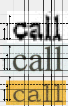
 In the illustration on
the left,
the top word is "call" from the CBS copy of the memo dated 18-Aug-73, from
"Harris took the call". The second entry is from my Word document, same word.
The lowest entry is from the word "calligraphy", typed into the invitation. Note
that when the words are the same width, the letters in the lower illustration
are smaller than the letters in the upper two. That's what I've done in the
other illustration, on the right. I show that the the three words are the same
height; note that the Executive version is substantially wider. This certainly
rules out the possibility that the particular model of IBM Executive typewriter
used for this document could have been used to create the 18-Aug-83 memo.
In the illustration on
the left,
the top word is "call" from the CBS copy of the memo dated 18-Aug-73, from
"Harris took the call". The second entry is from my Word document, same word.
The lowest entry is from the word "calligraphy", typed into the invitation. Note
that when the words are the same width, the letters in the lower illustration
are smaller than the letters in the upper two. That's what I've done in the
other illustration, on the right. I show that the the three words are the same
height; note that the Executive version is substantially wider. This certainly
rules out the possibility that the particular model of IBM Executive typewriter
used for this document could have been used to create the 18-Aug-83 memo.
For those who wish to repeat this experiment, what I did was as follows. I extracted the words from the documents using Corel PhotoPaint. I pasted them into a PowerPoint document, stretched one of them to a reasonable size, and drew lines on the left and right. I then stretched (maintaining aspect ratio) the other two words so that when they were aligned with the leftmost line, they also touched the rightmost line (the lines do not appear to touch quite right because these are reduced images, and there seems to be some small loss of line accuracy as I go from PowerPoint back to Corel PhotoPaint, which I have to do to create the GIF images used in this page).
Next, I created a line at the bottom of the middle word, the scanned image from my document. I then created the dashed line at the top of the "c" in the middle word, and a solid line at the top. Next, I "grouped" these three lines so they remained perfectly spaced, and dragged them down to the lowest word, the IBM Executive image. I then added the solid line above the "c" in the IBM Executive image, added the three little vertical arrows to clarify what is going on, and grouped the three vertical arrows, the line above the "c", and the existing three-line group into a single entity. As long as I do not stretch this, it is now a "ruler" I can use to measure the other words. So I was able to copy this ruler, paste it and align it with my scanned image, and paste it again and align it with the CBS image. Finally, I added the vertical lines based on the Executive spacing. To create the right-hand illustration, I copied the whole slide and repasted it to a new slide, then stretched the "call" (maintaining aspect ratio) so the "c" was now as high as the "c" in the other two. This is the basic technique I used for other illustrations, but I wanted to make sure others could reproduce any of these experiments, so I thought I'd go into more detail.
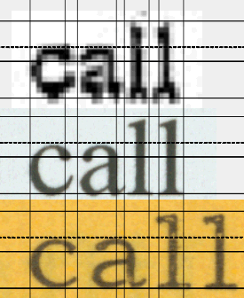
 Now, applying this technique, I
examined another part of the 1-Aug-72 "order". This is going to be a very
complex analysis, so I've added some "coordinate descriptors" so we can easily
refer to the diagram on the left.
Now, applying this technique, I
examined another part of the 1-Aug-72 "order". This is going to be a very
complex analysis, so I've added some "coordinate descriptors" so we can easily
refer to the diagram on the left.
Take a look at the third version down, designated element g, the one whose top-left-corner is J1. I had to form the word "flight" from the Executive by doing some gluing, since I could find an "fl" and an "ight", but not "flight". So what I did was use g as my "reference base". I placed vertical lines at what are now positions 3 and 7, defining the "ight" part. I then stretched, maintaining aspect ratio, the "ight" from the Executive sample, until it, too, spanned the distance 3-7. Then I drew a line, designed F, across the top of the "h", and another line along the "baseline" of the font, designed H. This gave me a defined height, the height F-H. I then inserted the "fl", to which I gave a different background color in order to show it is a separate object, and stretched it, maintaining aspect ratio, so that it, too, was height F-H. I then pushed it left until it lined up with vertical line 1, which was lined up with the left end of item g. This establishes, I believe, a convincing representation of the word "flight", as it might have been typed on an IBM Executive typewriter. I left in a little artifact on the far right, part of the "a" that was in the "fla" that I had actually extracted, so it is observed that I did not have much of an error in placement relative to the "i" of "ight".
Just concentrating on b and g, there's already something wrong, because with the horizontal aspect ratio set, b is height F-H, which is much shorter than the height of g, which is J-M, the same distance as E-H. And while the "f" and "l" appear to be approximately correct, and I can be a bit suspect of the "l" to "i" distance because of the pasting, the letter "i" itself seems inconsistent. I noted the deep serifs on the "i" in item b, but the apparently narrow serif in item g. Since "ight" came as a single scan from the Executive, I would expect that "ight" in would be quite similar in appearance. Even allowing for the horrible resolution, I would definitely expect see a better correspondence. The serifs of the "h" don't look similar, because the Executive sample has a deeper serif (F5-F6) than is visible in sample g, at position (J5-J6), and although an argument on pixel quantization could be made, this still appears to be anomalous. The slight upturn of the "t" serif at H7 does not seem to be reflected at M7, where I would expect to see bolder artifacts that would be very similar. The error seems to be greater than other artifacts in the scan would indicate. Also, the descender part of the "g" at H4 has a distinct separate from the line, but at M4 it touches. Not a powerful indicator by itself, but in conjunction with the other errors, it is one more difference. So we have a lot of differences comparing b with g. The difference in the little protrusion on the "g", near G5 and K5, could be accounted for by pixel quantization effects.
If I hold my little ruler up to my screen, the CBS text is approximately 74 units high; the Executive Typewriter output approximately 55 units high. Given that IBM prided themselves on their high-quality typography for this device, it seems unlikely that they would have distorted the vertical aspect ratio this badly.
I created another sample, which is going to be compared to Times New Roman under Microsoft Word. I did the rescale by doing a copy/paste, grabbing the top right corner, and dragging down (which maintains aspect ratio). I needed to create another sample of approximately the same height as b. But what I did instead was to create a version comparable to the width of the word "flight" in a Word file in Times New Roman. To get the correct width. I needed a reference size. So it became necessary to create one. At this point, I took the word "flight" from a 600dpi scanned Microsoft Word document that was created using Times New Roman 10 point font, and sized it so it was the same height as the sample b. This gave me sample a. Its nominal top left corner is B1, and its height is B-D, the same distance as F-H. Having created a sample of the correct size comparison in Times New Roman, I drew a vertical line designated 6, which touches the right end of sample a. Then I stretched the image from the 1-Aug-72 document so it extended the distance 1-6. Note that it appears to be a bit too tall. This is due largely to the poor image quality, but we will address this problem shortly. It is "close enough".
In the interests of time, I will explain, rather than take time to show, how I computed the error. I have a fine ruler (it is actually calibrated in points, 1/72 of an inch units, and I use it when I'm doing careful typography measurements). I held it up to my screen, and adjusted the "% magnification" in PowerPoint until I got a distance P-S that was 100 points on my ruler. The amount of error was 6 points, or 6%; counting the gray pixels, the artifacts of the scanning process. For now, I designate this acceptable error.
Now I had my sample d. I drew lines 2, 3, 4 and 5. These indicate the edges of some of the key character features in sample a. This meant I was able to compare a and d. I note that there is a better match of the letter "l" at location B2 and P2. It isn't perfect, but the low-quality scan could account for a pixel quantization error. The "i" seems centered between C2-C3 and P2-P3, while the "i" which is centered at G3-G4 and fills the cell, but appears to be left-justified in the cell at L3-L4. This seems to be greater than pixel quantization can account for. Allowing for pixel errors, the descender of the "g" at S3-S4 seems very close to the descender at D3-D4. And examination of the little object sticking out of the top of the "g" at C4 could, within pixel quantization appears quite a good match the with one at R4. The gap between line 4 and the "h" at C4 seems comparable to the gap seen at R4.
It is also worth noting that the distance between the "g" and "h" in sample b seems to be a bit wider than the distance seen in either sample a or sample d.
Line 5 touches the "t" at C5, and this is an extremely close match to what we see at R5. The serif of the "t" at D6 seems more credible, in the light of pixel quantization, with the tiny feature at D6 than with the much more pronounced feature at H6.
 But there is the question of that 6% error and its significance. So I did
another copy/paste/resize, using the other possible interpretation of where the
height was. This gave me a smaller version of the sample,
e. Note that this gives a substantial mismatch
with the features of sample , which leads me to believe that the horizontal
constraint on scaling is better than trying to use a vertical constraint. Using
my "points ruler" I measured the relative distances of these two distances on my
screen. The distance 1-6 is 162 units, while the distance V-X is
only 74 units. With a bit of rounding, this means that we have a leverage of
2.2, meaning that a 1-unit error in my vertical approximation generates a
2.2-unit error horizontally, or, reading the other way, a 1-unit error
horizontally induces a .46 unit error vertically. Therefore, the horizontal
constraint is the one I chose to use.
But there is the question of that 6% error and its significance. So I did
another copy/paste/resize, using the other possible interpretation of where the
height was. This gave me a smaller version of the sample,
e. Note that this gives a substantial mismatch
with the features of sample , which leads me to believe that the horizontal
constraint on scaling is better than trying to use a vertical constraint. Using
my "points ruler" I measured the relative distances of these two distances on my
screen. The distance 1-6 is 162 units, while the distance V-X is
only 74 units. With a bit of rounding, this means that we have a leverage of
2.2, meaning that a 1-unit error in my vertical approximation generates a
2.2-unit error horizontally, or, reading the other way, a 1-unit error
horizontally induces a .46 unit error vertically. Therefore, the horizontal
constraint is the one I chose to use.
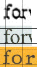
Just to drive the point home even harder; here's three instances of the word "for". The first word is from the CBS memo of the 1-Aug-72 memo, "forwarded", from the second line of paragraph 3. The second is from a 600dpi scanned image of my copy of the memo, same word. The third (on the yellow background) is from the phrase "for ever and ever" in the wedding program. Note the incredibly similarity of the CBS memo representation to the Word representation, and incredible dissimilarity to the IBM Executive Typewriter representation. The heights were adjusted to be consistent while maintaining aspect ratio. While purists might argue about the inability to really tell what the fine characteristics are from the poor quality of the CBS document, I think the letter-spacing argument dominates the "we can't tell the details of the serifs" argument. The IBM Executive Typewriter sample was typed, according to the creator, with no effort to perform any special letter spacing, such as line justification might require.
Note also that the shape of the letters in the Word document and the Executive Typewriter are quite different. The "f" has a shorter serif in the Executive image, the "o" is much rounder and with an apparent circular interior, which can be contrasted with the more elliptical interior of the Times New Roman font. The "r" has a more emphasized characteristic and the serif is much more pronounced. I suspect that if we are ever able to see high-resolution scans of the originals of the CBS memos, we will see that the the similarities of the top two will be quite evident. Even high-resolution scans of the "original copies" would do better than the fax-quality images we have been given access to.
There has been no fakery here. If required, I could probably get permission to post the full scans of the wedding program, but I would have to redact any identifying information, such as the names of the principals and others. Anyone could then repeat these analyses.
I assert based on this analysis that the 01-Aug-72 memo bears a much stronger resemblance to a Times New Roman font sample than to the IBM Executive typewriter font sample.
This is not strictly within my area of expertise, but I've been hanging around with archives experts, museum experts, and similar people for a long time, and picked this information up. These experts are often called upon to validate papers, objects, and artworks. One of the key concerns they have is what is called the "chain of custody". You may all be familiar with this from various TV crime dramas: was the evidence handled in such a way, from collection to analysis, that no tampering could have been done, or substitution made? If the source of the documents is unknown, then it is impossible to demonstrate an unbroken chain of custody, an important test of the authenticity of records. The chain of custody, as defined by the forthcoming publication from the Society of American Archivists (SAA) A Glossary of Archival and Records Terminology, is "the succession of offices or persons who held materials from the moment they were created".
We have a document spontaneously appeared. CBS does not have the original. They have no evidence of where the original came from, or any chain of custody to show that it actually originated at the Texas Air National Guard. If an archivist is asked to authenticate a document, the chain of custody would have been one of the key touchstones of authenticity. Lacking a clear chain of custody, the document would have to be authenticated from other evidence. Lacking the original document, such authentication cannot be performed.
I only raise this question here to suggest that this is one of the important questions that must be asked of these documents.
DoD, like most other large organizations, creates massive amounts of paper per day. Cumulatively, over thirty years or so, an organization like DoD, which lives on paper, would gradually accumulate enough paper to cover the entire continental U.S. (and possibly Alaska and even parts of Canada) with the paper generated, probably to several inches depth. Therefore, all such large organizations have what are called "retention schedules" for their records. Some records are kept permanently. Some are disposed of in days. You've used retention schedules, even if you hadn't heard the term before. How long do you keep your cancelled checks, for example? How long do you have to keep your tax records? These are all "retention schedules" you may be familiar with. Record managers are observing that documents of the type CBS has released would most likely have been part of a retention schedule that would have converted these documents to mulch decades ago. To bolster the authenticity argument, it would be necessary to produce a formal "retention schedule", a document that "identifies and describes an organizations records...[and] provides instructions for the disposition of records throughout their lifecycle".
Somehow, magically, these few documents have appeared, but with no explanation that contemporaneous documents of a similar nature also survived. I am not an archives expert, but someone who is should be raising this question. I only mention these archival issues to show that there are many other reasons to suspect modern forgeries. This makes my analysis more credible. The point being that the nature of these records appears, to professional archivists, to suggest that such records could not have survived thirty years. Even given the unlikely event that an IBM Executive Model C or D (several correspondents have told me this is a better candidate than the Selectric Composer) typewriter had been used (having appeared in time to do these memos, then apparently disappeared again for months), there is the suspicion that these records might have long since been disposed of. But see my analysis of one model of the Executive typewriter, above. Producing a huge number of similar contemporaneous records, in the same format, and which can be authenticated, including an unimpeachable chain of custody, would strengthen CBS's case.
The "wishful thinking" model of scientific analysis seems to still be true. This is the methodology by which someone says "I wish this were true, and consequently it must be true, so anything that even vaguely suggests that it would be true is utterly convincing evidence that it is true". The Times New Roman font issue seems unkillable.
I have already deconstructed the amateur attempts of Dr. David Hailey to prove beyond any doubt that the documents were typed on a typewriter. His analysis is almost a parody of scientific methodology, and has provided me with numerous examples for a lecture I'm giving on how to do bad science. But numerous correspondents have insisted that it was easy to kern type, that the Times New Roman font existed, and the kerning argument is invalid, as is the letter-shape argument. I had some time to spend at the Library a few days ago, so I went to the microforms division and made a copy of some pages of the New York Times. The word I show is from an article found on page 51 of the New Jersey edition of the New York Times on Friday, December 15, 1972. For those who wish to double-check, the article is titled "Court Clears Kawaida Site of Pickets", and the word is from the 6th line down of the second column, from the line "tors from picketing on Lincoln".
 Now
what I have here is a scan, taken from a printed image, made from a microfilm
copy. So there are several levels of transformation that have gone on here.
Now
what I have here is a scan, taken from a printed image, made from a microfilm
copy. So there are several levels of transformation that have gone on here.
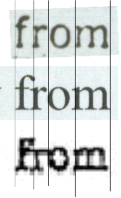
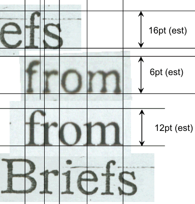
At the figure on the left, the middle image is from a scanned output from Microsoft Word. The bottom image is from one of the CBS memos. Note in the comparison that the "f" and "r" of the two lower images show some overlap. But in the Times New Roman from the New York Times, the "f" and the "r" are seriously disjoint. Now it is possible to attribute this to image lossage through the several levels of copying that I described. Note that the vertical alignment of the "r", the "o", and the "m" are quite close to the Microsoft Word output. So, is the appearance of the "f"-"r" combination the result of image degradation of fine detail, or is it really the case that the fonts are not kerned.
To eliminate the possibility of image degradation, I found a larger image of an "f" on the same page, in what appears to also be Times New Roman, in the word "Briefs", as in the headline "New Jersey Briefs". In this case, I placed horizontal lines around the Microsoft Word 12-point font and stretched the word "Briefs" until the "f" filled the vertical space. I then placed the word at the bottom aligned with the "r", to demonstrate that the "r" is stylistically consistent with Microsoft's Times New Roman font. I placed the other copy above the smaller "from", and dropped a vertical line from the right edge of the upper "f" downwards. Using my 10x magnifier and my points ruler, I measured the height of each word in my paper image (remember this is a print from a microfilm copy). I estimate that the upper image was approximately 16 points. The lower image was from the body text of an article, and was approximately 6 points high. Note that the upper serif of the "f" is "tight", and allowing for the optical distortions in the microfilming and printing processes, it appears that both the upper and lower "f" symbols from the New York Times are consistent in this regard. But the "f" from the Microsoft font is quite pronounced. Now imagine what the New York Times "f" would look like if it were scanned with the same pixelization as the CBS memo. We should see a similar gap between the "f" and the "r" as we see in the right-hand illustration, yet we see the "f" and the "r" quite tight, running together, which would be consistent with the behavior of Microsoft Word output that was scanned and highly pixelized. Because of the possibilities of the severe optical distortion it is difficult to conjecture about the finer details of the serifs at the bottoms of the letters, but the serif at the top of the "f" is a quite pronounced thickness, and would not have been lost as readily in the various levels of optical transformation.
In light of all this evidence, I therefore assert that the actual New York Times font of the 15 Dec 1972 edition of the paper is incompatible with the font found in the Bush Guard memos, and therefore a device which was capable of replicating this font could not have been used in the creation of these memos.
Please feel free to quote this material, use any of my images, etc. if you are reposting. I do ask that you provide a link to this page.