
The Bush "Guard memos" are forgeries!
The Hailey Followup
|
|
Home |
 |
Resume |
|
|
|
|
The Bush "Guard memos" are forgeries!The Hailey Followup |
|
| UPDATE HISTORY | |
| 12-Sep-04 | Kerning and pseudo-kerning. Digital signature copying. |
| 13-Sep-04 | Varityper |
| 13-Sep-04 | Comparison of numeric 1 and lower-case L |
| 15-Sep-04 | The Selectric Meltdown |
| 17-Sep-04 | More about the Selectric Meltdown; Pixelization |
| 18-Sep-04 | The IBM Executive Typewriter; Chain of custody; Records retention cycles |
| 3-Oct-04 | The Hailey Connection |
| 10-Oct-04 | The New York Times Font |
| 11-Jan-05 | The Columbia Journalism Review |
Dr. Hailey finally responded to my several critiques of his analysis. Unfortunately, he did not do a very good job of his response. It resembles a random collection of incoherent ramblings rather than a reasoned summary of the issues. He seems to ramble on about bizarre syllogisms which seem to be more concerned with interpreting "who is right" instead of "what fact is true"; frankly, I couldn't follow it very well. At no point does he demonstrate that anything conclusion he has arrived at is actually supported by factual evidence, nor does he explain how he can see features of a font that do not exist. He even attempts to explain scientific method to a scientist. He makes claims about what he said in his report that are actually inconsistent with what is printed in his report!
He seems upset that he is beset by bloggers accusing him of all sorts of nefarious acts. Nobody has seen me whine about those who have accused me of everything from being a member of the Nazi party, to being in the pay of Carl Rove, to simply not existing. This is part of the price you pay for having a Web presence. The difference between the two of us that he actually has committed some serious errors in his analysis. I can prove his work is worthless without even assuming any attempt at fraud; his methodology is so poor that any conclusion arrived at using it is suspect.
Let me start at the beginning.
I use the phrases "prestidigitation" and "red herring" carefully. He also seems to have missed mentioning "legerdemain", which I feel I was justified in using.
The type wear argument is nonsensical. First, he does not actually prove the inconsistencies he sees are due to type wear; he ignores other indications of problems, and even in his Figure 12, which I did not cite, he does not actually prove anything. He shows the "e" symbol apparently shows some damage, but he makes several fundamental errors in this analysis. He does not show examples of other characters with curves, such as "c", "d", "o", "p", "q", or "s". Instead he shows characters with very small bottom components, such as "h", "n", "w" and "m". The only good example he has is "f". But that is not enough of a statistical sample to arrive at a conclusion. In addition, it is easily seen that there are other errors in the "e", some of which are larger than the wear he claims, which could be due to ribbon errors. But he does not discuss this. In doing scientific measurement, you cannot place reliability on a metric that has error bounds in excess of the value claimed. He does not relate the apparent wear to type position; the problem may not be in the type ball, but in the mechanism. For example, the layout of a Selectric typeball is
| Shifted position (rotated) | Unshifted position | ||||||||||||||||||||
| ( | ) | ¢ | % | @ | Z | $ | * | & | # | ! | 9 | 0 | 6 | 5 | 2 | z | 4 | 8 | 7 | 3 | 1 |
| B | H | K | E | N | T | L | C | D | U | X | b | h | k | e | n | t | l | c | d | u | x |
| W | S | I | " | . | ¼ | O | A | R | V | M | w | s | i | ' | . | ½ | o | a | r | v | m |
| _ | Y | Q | P | + | J | ? | , | : | F | G | - | y | q | p | = | t | / | , | ; | f | g |
So he starts with a document of unknown provenance, analyzes a few letters (as shown in the above chart), and claims that the "e" shows more wear than other letters. Actually, it is not clear that the artifact we are seeing is type wear. We are supposed to trust his assertion, presented without proof, that the distinctions he sees are representative of type wear. Maybe it is, maybe it isn't. We can't tell from his analysis. He later shows illustrations of a Selectric typeball, but shows no illustrations of what the printout from that typeball looks like. So we have nothing other than his opinion that this illustrates type wear, and this wear would be visible on a typed document. If I were going to make such an assertion, I would find a worn type ball and type something with it, then type something with a brand new type ball, and compare the two. Then I could say something meaningful about type wear. But there's not real evidence that what he is demonstrating is type wear, as opposed to perhaps ribbon wear over time, or mechanism wear.
But the whole analysis of font wear is meaningless in terms of the CBS memos. They were faxed. Faxing reduces the character to 200dpi, black and white. This is a massive amount of information lossage. The type wear he claims to see requires resolution below this limit. But the Nyquist Sampling Theorem (or the Shannon-Nyquist Sampling Theorem, since it was Claude Shannon who provided the formal mathematical proof) says that at 200dpi, the smallest feature you can resolve is at best 1/100 of an inch. The compounded effects of Moiré effects at the initial scan and Moiré effects of the CBS scan of the faxed memos introduces even larger errors to the images. I can see errors larger than his purported "type wear" just by taking the identical document produced in Microsoft Word and faxing to myself three times! So analyzing the direct output of a Selectric typewriter is meaningless; even if he had proof that type wear shows up, the only way to justify its applicability to the CBS memos would be to take a document which showed wear, a document which showed no wear, fax them both at 200dpi, and compare all the instances of "e" that resulted. I have done this with Word documents, and there is no correlation of any faxed artifacts with the original. The same letter appears distorted in assorted different ways on a single document. The distortions are significantly larger than the "type wear" Hailey claims to see. Given the data is noisy, making assertions based on an ability to analyze data that is both below the Nyquist limit and which is demonstrably impossible to derive from a faxed copy is a meaningless exercise.
I have done this experiment, but the image is quite large, about 233K bytes, so I've put it in a separate page. This is only to save you download time in case you already believe the obvious.
I think his basic approach to type wear is flawed. He shows some nice photomicrographs of an IBM Selectric type ball; this is definitely good. He does not show the corresponding typed characters associated with those images. If I were trying to make this point, I would correlate the images of the damaged type with high-resolution scans of the results of using that type ball. Using Photoshop or Corel Photopaint, I would mirror-image either the type image or the printed image so a direct correlation could be seen. Instead, he takes some documents which he alleges show type wear, extrapolates from those documents (scanned at 4200dpi, he claims) to documents scanned at 200dpi, then rescanned at some other resolution, converted to PDF files, extracted, and then examined. I have given every step of my analysis. I do not see a corresponding sequence of detailed steps in his analysis.
I should point out that his hypothesis of type wear is a good hypothesis. However, there is insufficient data to support it. If he had the original documents, he might have a valid point of discussion; unfortunately, he compares images from documents with images that have gone through several transformations. While there is a great deal of rich information still available from those documents, type wear cannot be among them. Since his basic premise is flawed--that he can see type wear in a faxed, then scanned, then converted to PDF, then converted-to-image document, the details of his analysis of type wear are largely irrelevant. The entire argument can be dismissed as a waste of time and document space. It proves nothing, because there is simply no data capable of supporting it.
I'm not at all sure where his argument about logical failures and prestidigitation fits into the discussion. Hailey himself seems to equate "Typewriter" (the specialized font) with "typewriter" (typewriter fonts in general). He seems to think that because he can find some sort of correspondence between a modern computer font and the memos that it is clear the memos were typed on a typewriter. For example, in his Figure 8 he has a set of incoherent and unrelated sentences, some of which are provably false.
The above examples of variations in Typewriter, digitized.
He does not explain how he scanned them or otherwise got these images.
In some cases, the examples are taken directly from antique typewriters and digitized for use on computers
Unfortunately, he has no basis for this assertion, and the facts are that ITC Typewriter was not created until 1974, and by the evidence presented by ITC,
ITC American Typewriter was never intended for typewriters. It was designed in 1974 as a proportional spaced typeface that mimicked typewriter type.
This is from a message from ITC in response to a query by Geoff Matthews, a private communication quoted here with his permission. Note that the operative parts of this are "designed in 1974" and "mimicked typewriter type". At no time does ITC claim that these fonts were taken from antique typewriters and digitized for use on computers. So the entire basis of Hailey's argument, that ITC Typewriter represents digitized antique type fonts, disintegrates.
The Bush memos are done in a species from this genus.
I seriously doubt that. When Charles Johnson has already demonstrated that there is what is very close to a perfect match with Times New Roman, Hailey's analysis, based on a flawed premise (that the Typewriter font represents typewriter fonts), using an analysis (fine details) impossible to perform on a faxed copy of a document, seems to be untenable. Perhaps I failed to capitalize "typewriter" as often has he thinks I should have, but he's the one that is claiming the equivalence; apparently when I claim it, I'm in error. I guess I don't follow the logic. But trying to analyze font characteristics from individual letters, when you only have 200dpi resolution, is not going to yield meaningful results.
It is worth noting that a certified, highly respected document examiner employed by the Thornburgh panel arrives at the same conclusion Charles Johnson and I do, that the font used is Times New Roman.
Hailey claims that I have faulty logic. My logic at least follows basic rules of scientific evidence.
Hailey misses the point of the scientific method. He doesn't have to take my word for it; he should simply read what experts have to say. For example, he might consult http://teacher.nsrl.rochester.edu/phy_labs/AppendixE/AppendixE.html to see how a scientist explains the scientific method.
He claims that all he did was step 1, yet somehow he manages to arrive at conclusions, using the other three steps He even claims, in his incoherent diatribe,
Newcomer sees no validation in my hypothesis because I had none -- I had nothing to prove, only things to discover.
Yet he has lots of things he chooses to prove, including the fact that he can see type wear in the fonts, that the font is not Times New Roman, that it was typed on a typewriter, and so on. His document is riddled with examples of his claims that he has demonstrated that the document had to have been typed. That sure sounds like a set of hypotheses to me. He had not just one hypothesis. He has lots of them! But he apparently doesn't recognize that he has done this!
In fact, his title suggests strong that he has a hypothesis, which he spends most of the report proving: that the font in which the documents are produced can be precisely identified. He even states his hypothesis explicitly on page 5 of his report:. Note that I have pointed out his hypotheses, since he clearly is incapable of seeing them.
- The font is a common typewriter typeface invented at the beginning of the 20th century and in continuous use until the computer replaced the typewriter. The font's name is "Typewriter". Although the typeface was somewhat modified for civilian communities in the 1960s, it remained commonplace in the military well into the 1970s. In short, the Bush memos were produced in a version of Typewriter commonly used in the military at the time.
- It may be possible to find worn and damaged characters. The top left of the "t" appears to be worn to the extent that it seldom makes an impression. The "e" shows indicators consistent with physical damage. The "a" and the "s" show similar indicators of wear and/or damage.
- Seldom used characters such as numbers, capitals, and the lower case "o", "q", and "p" (and the other less used lower case characters) show no sign of damage.
- Flaws in the characters are not random as one would expect from artifacts from copying but are sufficiently inconsistent to imply inconsistent (mechanical) printing.
- There are indications of white "blisters" perhaps cause by a character typed on paper that was deformed by the impact of the previously struck character.
OK, I can forgive him the confusion of four with five; I've done it often enough myself, which is why I never use a number in that position, but that's just a detail. But he goes on
Even to make the four sub-points which are the reasons he believes they are not digitally produced, he has to form a set of hypotheses and test them. For example,
1. It is a common typewriter typeface.
There is no real evidence to support this. No known typewriter typeface has the letterforms and pseudo-kerning (hence the word spacing) of Times New Roman under Microsoft Word (using, we must re-emphasize, the default settings of Word!). There seems to be no evidence to support his hypothesis.
Of his many methodological errors, the one he fails worst at is taking into account the combination of pixel quantization and Moiré effects in faxing. Thus at the fine detail level, there is simply insufficient information to reconstruct what the font is when examined on a letter-by-letter basis. Instead of selecting random letters, he instead selects letters that make an "best match". Throw away all the data that disagrees with your hypothesis? This is science?
There is no possible way to use any computer font as a basis of proving a document was typed on a typewriter. When I was poking around the Internet, I found the American Society of Questioned Document Examiners has a link ("Products and services") to a page describing the Haas Atlas CD set (6 CDs), which is a digital version of the printed catalog of typewriter examples. If I were trying to compare an unknown document to a possible source typewriter, I would want to use this resource, not some random computer font that contained the word "Typewriter" in it. As a non-member, it would cost me $875. If I joined, I could buy it for $675. Not like it is a big deal to do the job right.
In the measurement business, there are "primary standards", which are usually maintained either by a national organization. In the USA, this is NIST, the National Institute for Standards and Technology. A number of standards are regularly calibrated against these standards. These are known as "secondary standards". People who need to make precise measurements spend a lot of money to buy measurement equipment which has long-term stability, and regularly send it to very expensive laboratories to have it recalibrated against a secondary standard. In the case of the Haas Atlas, this represents a tertiary standard calibrated against the secondary standard (the primary standard being the images typed directly by typewriters themselves; the secondary standard being the scanned and digitized images. A tertiary standard would be the display of these either on paper or on the screen). A computer font, no matter what its name, is an uncalibrated reference, and any scientist would recognize this as a meaningless basis of comparison to determine if an actual typewriter had been used.
Here's another hypothesis:
1. The document is done in Times New Roman under Microsoft Word
From this I conclude that the document was produced using Microsoft Word. This leads to
Thus I arrive at the conclusion that the documents are produced using Microsoft Word
So let's examine some of those other issues Hailey discusses. For example
2. The documents were typed on a typewriter
He bases this on issues of type wear. So let's consider the issues of type wear.
This presumes that there is sufficient resolution to distinguish type wear from the artifacts of faxing. It also suggests that damaged characters will exhibit consistent wear patterns after having been faxed.
Counter-hypothesis: character distortions are due to the set of transformations including possible copies preceding the fax, the faxing operation, the scanning operation, the PDF conversion operation, the conversion to a printed document, and the scanning of the printed document to examine the actual printing effects.
I have not conducted this experiment, because it requires both a lot of time to prepare, and the problem is that I would be experimenting on myself, so it would not be a classic single-blind experiment. So an independent party has to produce the examples I would need to examine. In addition, I do not have an IBM Selectric typewriter with a known worn type ball that could be used to create a standard example of worn type. However, the very fine details that Hailey demonstrates are considerably smaller than the pixel quantization and Moiré effects of a 200dpi fax.
3. Certain letters show greater wear than other letters.
Given that I believe it is impossible to see wear, due to the numerous artifacts of the copying, faxing, scanning, and conversion processes involved, it would be impossible to determine the relative wear of the letters. This can actually be readily seen just by examining the actual documents. There is not, as Hailey asserts, consistent wear on letters in all memos; I can show completely inconsistent letters within a single document, and in fact, in two cases where I compared "ee" (for example, as in "agrees") I see different letterforms in adjacent letters. It seems unlikely that we would see massive wear changes between two successive keystrokes. Hailey conveniently ignores this data, which means his conclusions are suspect.
4. Inconsistent characters indicate mechanical processing.
5. The letterforms exhibit white blisters which indicate mechanical deformation of the paper
Here is the result I got in an actual experiment. Of course, to get statistical significance I should perform this experiment with 1, 2, 3, 4, 5 and 6 sheets of paper, on a variety of typewriters, and perform them several times, to collect enough information to state a confidence interval of my results. Consider this an informal experiment. However, it someone wishes to prove that multiple sheets of paper do result in the phenomena Hailey hypothesizes, they are free to do so. Full details of the experiment must be disclosed.
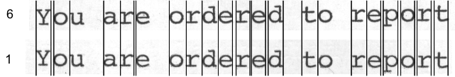
The upper line was typed on the topmost of six sheets of ordinary 20# typing paper; the bottom line was typed on a single sheet, using an IBM Selectric typewriter. The image was scanned at 2400dpi.
Always note that you, too, can perform any of these experiments. All you need is a typewriter and access to a fax machine. The experiment with worn type is harder to perform, but could be. I have not performed it. Access to a scanner is handy, but you can do the same thing with a camera with a good macro lens and a calibrated reticule.
Then there are his absolutely hilarious statements presented as if they were facts, with nothing to substantiate them at all. Not even an attempt is made to justify the following absurd statement, which appears on page 12 of his report:
The ability of the military to produce the proportional text with a superscript "th" with a typewriter is beyond question. If I remember correctly, IBM is on record as saying they have made machines capable of that since 1944.
This has so many ridiculous claims in one place it just boggles the imagination. Let's look at them independently (by the way, he's using a cheap lawyer trick here, of building a compound sentence for which there is no simple yes/no answer. As an expert witness, I have to watch out for statements like this and corresponding questions framed in the same way). Let's break this down a bit into its component parts:
Sure, lots of military offices had IBM Executive typewriters. Too bad TANG was not among them! So what relevance does this sentence have to analyzing the documents in question? None whatsoever, since there were no Executive typewriters available. But let's assume he couldn't know that (for example, assume he was writing his report before the existence of the IBM Executive typewriter was categorically denied by Mary Knox, Killian's secretary, instead of weeks after she made this statement).
To make this assertion, he presumes that these typewriters could produce absolutely identical output to Microsoft Times New Roman. The actual evidence, from output produced by an IBM Executive typewriter, shows this is not so. IBM Executive typewriters did not do pseudo-kerning identical to Times New Roman, for example. The letterforms were different, and the word layout was different. So even in the absence of first-person testimony that there were no such devices available, his statement is incomplete. To make it meaningful, it should say "The ability of the military to produce proportional text, in 1972, that is precisely identical in all respects to Microsoft Times New Roman, is beyond question". But if he had said that, it would be so obviously absurd that it could not hold up. (I know, I know, he doesn't believe it is Times New Roman. But no other font yet postulated can reproduce the Johnson experiment as well. And besides, who cares if another computer font is a better match? It still means it was produced on a computer).
Too bad he can't actually reason about this point. It is clear that an Olympia typewriter could do this; in fact, according to an actual typewriter expert, it was the only typewriter in the 1970s that had this as a standard option (ah, I hear the cries but what about nonstandard options? OK, find an example. Don't just wish there might have been an example. Find one, and find one that produces superscripts, letterforms, and layout identical to Microsoft Word using Times New Roman with the default settings). And the incredible difference in appearance between the ligature "th" of the Olympia typewriter could never be confused with the actual superscripting done by Microsoft Word. Yet the superscripts we see in the CBS documents do not at all resemble the Olympia typewriter, and precisely resemble the automated superscripting of Microsoft Word.
Now, somehow, he takes these two independent statements, one of which is true in general but not true for TANG, and the other of which is simply nonsensical because he cannot tell a ligature from a superscript, and combines them into a single sentence that we are supposed to accept as "beyond question". And this is supposed to prove the CBS documents were typed on a typewriter which did not exist at the office of origin, using a feature that did not exist on that typewriter, and in both cases the output would be visually incompatible with the documents CBS claims is authentic!
Sure, IBM has been manufacturing the Executive typewriter since, well, I guess I could take the additional 45 seconds to look it up, rather than trust my memory: google, "IBM Executive typewriter". Click. That's not it. Scroll. "IBM Archives: 1941". Click. Oh yes, 1941, with the IBM Electromatic Model 04. When doing a scholarly work, it does pay to spend a little bit of time to actually do the research. But I digress.
Nonetheless, he uses "that" to suggest that both proportional spacing and superscripts were available on the same typewriter. There is no evidence this is so. In addition, we always have to return to the key point: none of these devices were capable of producing output precisely like Times New Roman. And no such typewriter existed at TANG anyway! So ascribing to a product a set of nonexistent features, and the ability to produce text that looks precisely like Microsoft's font, somehow proves that the CBS documents could have been typed on this typewriter. Handwave, handwave. This is a true piece of legerdemain.
Several other hypotheses were suggested, either directly to me via email, or on the blog sites. These included:
A. The documents were typed on an IBM Executive typewriter
B. The documents were typed on an IBM Selectric Composer
or an alternate approach
C. Typewriters of the day could produce superscripts
I could do more, but you get the idea. While these latter hypotheses were not addressed directly by Hailey as such, they are consistent with the sort of questions he asked. Hailey, in spite of his protestations, actually attempted to formulate hypotheses and prove them. He used faulty logic, ignored actual facts before him, selected his examples carefully instead of using all the data available (see his caption to Figure 2, in which he states "By extracting a large number of examples from the memos, I can hope to find a few good enough to act as templates" [emphasis added-jmn]. Choose the characters you like, and ignore the rest, and you can probably match a whole lot of different fonts. But this presumes that character-by-character matching is sufficient; my approach was to look at interletter spacing and consequently at word presentation, which is a lot more meaningful), and in general failed to follow the scientific method. Just about every example he has chosen is contradicted by the data available, which did not prevent him from ignoring the actual data and arriving at erroneous conclusions.
I hope I have explained this in sufficiently simple language that both David Hailey and Corey Pein will understand it.
Dr. Hailey apparently understands copyright law about as well as he understands scientific method. He even sent me a note, on 9-Dec-04, which said,
Dear Dr. Newcomer,
I have read your discussions of my work several times and find it interesting. I also read your own report.
I worry that you cannot examine the issues you examine, but you already know that.

In the end, physical evidence will win out. But then I'm prepared to accept that; it's simply part of the process.

You may have noticed that although I discussed your work obliquely, I was not so rude as to use your images.

As a patent holder, you are, I assume, familiar with the various ownership issues involved here.
Unless you get my permission first, you may not display any art I have produced -- even the press
is not allowed to do that. Nor may you adapt my art to your purposes. You may point to it on my site,
but you have no permission to serve it from your site.

My document specifically reserves all such rights except by permission. Please remove any images you may
have taken from my site from any documents (digital or otherwise) you have produced until you receive my
permission to use them.


David E. Hailey, Jr, Ph.D.
Associate Professor -- Technical Communication
Department of English
Utah State University
I received exactly one of these. He did not send me "repeated" messages, as he claims in his incoherent ramble. Just exactly one. During the time he sent this, I was out of town. I returned on 20-Dec, and frankly had little time before the holidays to do much of anything. I was weeks behind on my email, and had to prioritize some issues. I was gone the first week of January, 2005. I did not return to my computer for serious work until 11-Jan-05. Perhaps in his world people have nothing to do all day but sit around and answer email; I, alas, have real work to do and it takes precedence over everything else.
I have both his original Web site, and the PDF file from which I extracted the image. Neither one of these contains any claim that "specifically reserves all rights except by permission". I read them very carefully. In any case, such a phrase is not necessary under the new copyright law; all publications are copyrighted at creation. And it wouldn't matter even if this phrase appeared, since Fair Use comes into play (see below).
He is also confused about the difference between patent law and copyright law, but only someone who actually knows these are different issues would know that he is confused. I was working at the Software Engineering Institute during the time that Pam Samuelson was there, and I can say that I understand a lot about patent and copyright law. You can't attend seminars by someone as good as she is and not learn something significant.
However, I did check copyright law. I actually am familiar with copyright law, having been an expert witness in a copyright dispute over code. I commend the following section for perusal by all (you can visit the Copyright Office at http://www.copyright.gov/title17/ and download the appropriate files of the U.S. Copyright Law. The excerpt below is from page 18 of the complete document you can download from that site (1.4MB PDF file, if you click that previous link). I felt that I should actually find the verbatim copy of the law to demonstrate that I in fact know what my rights are.
| § 107 • Limitations on exclusive rights: Fair use. Notwithstanding the provisions of sections 106 and 106A, the fair use of a copyrighted work, including such use by reproduction in copies or phonorecords or by any other means specified by that section, for purposes such as criticism, comment, news reporting, teaching (including multiple copies for classroom use), scholarship, or research, is not an infringement of copyright. In determining whether the use made of a work in any particular case is a fair use the factors to be considered shall include—
The fact that a work is unpublished shall not itself bar a finding of fair use if such finding is made upon consideration of all the above factors. |
It took me about five minutes to locate this paragraph. Perhaps Dr. Hailey is not as familiar with copyright law as he claims to be. Perhaps he never bothered to look it up at all, but instead relied on something he once heard someone say. I have no idea. It is worth noting that, in opposition to his claim, a newspaper may actually be allowed to use his material for purposes such as news reporting. My use is criticism, comment, quite possibly even news reporting, and I believe I could make a case that teaching is another purpose of my analysis, certainly scholarship, and most certainly research. But I only need one of those to justify the use. I properly cited his work; I did not claim it for my own. I even gave Web links to his work. Therefore, I fulfilled the requirements for proper scholarly citation, and met the requirements of copyright law.
In addition, if we look in detail at the points to consider
Finally, his work was most definitely "published"; that is implicit on its being on a Web page.
So my initial reaction on seeing his request was to say "fair use, I have crises to deal with". Now that I have time to deal with it, it is clear that I have met the criteria for "fair use". I see no limitation here that a copyrighted work is limited to text only; in principle, if he had published a musical work as a MIDI file and I wanted to critique some aspect of it, or use some snippet of it for educational purposes, I am within my rights. Therefore, I am not obligated to remove any of his images from my site.
In addition, he says he is "not so rude as to use my images". Please note the permission given below, which appears on each of my Web pages on this topic. He has my explicit permission to use my images, and it would not be rude of him to do so. I consider my use of his images to be covered by §107 Fair Use, and therefore there is no rudeness involved either. I am exercising my rights under law as a researcher.
All told, the work of Dr. David Hailey Jr. is very poor. It uses an undocumented methodology, he ignores the actual data which contradicts his results, reports conclusions which are inconsistent with the actual factual data which anyone can examine, and consequently its conclusions are erroneous. As I have stated, a 12-year old with access to Microsoft Word can readily produce an experiment which contradicts his result. I said so. He doesn't like the fact I say so. That's the nature of research: adopt a bogus approach, you get bogus results, and you get poor reviews. And as I stated in my original posting, he made claims that his critics did not have the qualifications to denigrate his work. I have the qualifications, and under peer review, I would reject his work for publication based simply on its poor methodology. Given that I, and you, too, can examine the same data and demonstrate that his results are inconsistent with the actual data, this leaves very little credibility to his work.
Please feel free to quote this material, use any of my images, etc. if you are reposting. I do ask that you provide a link to this page.