
The Bush "Guard memos" are forgeries!
The Hailey Connection
| Home | |
 |
Resume |
|
|
|
The Bush "Guard memos" are forgeries!The Hailey Connection |
|
| UPDATE HISTORY | |
| 12-Sep-04 | Kerning and pseudo-kerning. Digital signature copying. |
| 13-Sep-04 | Varityper |
| 13-Sep-04 | Comparison of numeric 1 and lower-case L |
| 15-Sep-04 | The Selectric Meltdown |
| 17-sep-04 | More about the Selectric Meltdown; Pixelization |
| 18-Sep-04 | The IBM Executive Typewriter; Chain of custody; Records retention cycles |
| 10-Oct-04 | The New York Times Font |
| 20-Oct-04 | Some personal reflections on this whole experience. |
| 11-Jan-05 | The Columbia Journalism Review |
| 11-Jan-05 | Hailey's response to my work |
A counterargument was presented by Prof. David E. Hailey. This link to his work may or may not work. There has been sufficient controversy about his publication that it has been removed at least once, then put back. It may go through several cycles of this before this affair ends.
What bothers me about his report is that it claims to be an investigation into the font used in the memos. This would, indeed, be a valid piece of research, and would add to our knowledge of the memos. However, he appears to abandon this goal in the first sentence, where he clearly states "The following evidence from a forensic examination of the Bush memos indicates that they were typed on a typewriter". This statement is inconsistent with his title, so he immediately has violated one of the fairly formal principles of scientific writing: your title accurately describes your work. In reading this work, I found it deeply flawed. This was before I was linked to the Wizbang article, described in the next paragraph.
Notable work was performed by another poster, "Paul" at wizbangblog, who has done exemplary work on the analysis of the Hailey posting, including several aspects that suggest the analysis itself is fraudulent. I thought I should add a few words of my own analysis here. (An alternative explanation is that Hailey has proven conclusively that the font used was not Times New Roman, but ITC Typewriter, which suggests that this font was used on a computer under Word. I do not feel like paying $179 for the fonts to confirm this theory).
I think the Wizbang posting is completely devastating to his presentation, and you are certainly welcome to go read it. In fact, you should. But my objections are that even if he had not apparently fabricated the examples from modern computer fonts, using cut-and-paste instead of valid computer output, his methodology is seriously questionable.
There have been serious accusations of fraud that was committed in his analysis. I have avoided reading any details of this, beyond the initial posts which I have cited. I have avoided reading more because I believe the work is scientifically flawed, making several serious errors of methodology and numerous statements unsupported by the actual evidence available. On the whole, my assessment of his work deals with his presentation, his methodology, and his conclusions derived from that methodology, although I will from time to time make reference to the fact that he has been accused of "fudging the data". His methodology is rarely explained to the level where anyone else can replicate his experiments. What might have been construed as a possibly interesting experiment has been tainted by his failure to describe his technique in such a way as to make it apparent that he was not attempting to demonstrate that the document could have been produced on a typewriter, but instead was merely attempting to show some font correspondence issues. However, doing so would have weakened the case he actually set out to make (as stated in his very first sentence of his abstract), and this makes many people question not only his methodology, but also the fundamental validity of his research and his results. However, bear in mind that when I started writing this section, I was not aware of this issue, and therefore evaluated his work as any peer-reviewer would evaluate a scientific paper. After reading the accusations of fraud, I did, in expanding my discussions, make reference to these from time to time, only because some of the analysis suggests that a careful evaluation of his methodology should be made.
I would like to point out to the reader that I am fully qualified to perform peer review on this work; I have a Ph.D. in Computer Science from Carnegie-Mellon University, and I have been involved in document production since at least 1970. Those who wish to know more details may check out my resume.
From his document:
The following evidence from a forensic examination of the Bush memos indicates that they were typed on a typewriter
1. The specific font used is from a typewriter family in common use since 1905, and a typewriter capable of producing the spacing has been available since 1944.
2. The characters "e", "t", "s" and "a" show indications of physical damage and/or wear consistent with a well used typewriter
3. The characters that are seldom used show no signs of damage or wear
4. The quality of individual characters is inconsistent throughout the memos beyond expectations from photocopying and/or digitizing but quality is consistent with worn platen and variations in paper quality
5. Overlapping characters occasionally indicate paper deformation consistent with hammered impressions.
6. Critical indicators of digital production or cut and paste production are missing.
Hailey also gives a discussion, fairly late in the document, about the superscript, although no point in his abstract suggests that superscripts will be discussed.
Certainly, all typewriters up to the IBM Executive used monospaced fonts, and most typewriters for decades after the IBM Executive was introduced, still used monospaced fonts. All fonts were the same height. You bought one of two models of typewriter: Pica or Elite. Pica spaced characters 10 characters to the inch, and Elite spaced characters 12 characters to the inch. Within these constraints, on a monospaced typewriter you often had a choice of several typefaces. As already observed, the IBM Selectric Composer could change fonts, and with some difficulty change font sizes, but it is irrelevant because such a device was not in use at TANG. So while the Selectric Composer seems to be the darling of the wishful thinking approach to document validation, I have not only demonstrated it is impossible to credit, but those who actually own and know how to use IBM Selectric Composers have demonstrated that its output does not in any meaningful way resemble the CBS documents.
Nonetheless, Hailey presents a deeply flawed analysis of a superscript, without managing to account how a 1904 typewriter or any "ordinary" typewriter known to exist in 1972 could have produced a superscripted, smaller-font "th" that precisely resembles the output of Microsoft Word.
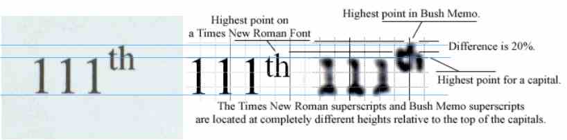
Hailey's superscript comparison is deeply flawed, only because anyone with the skills to work with an image program can show that the superscript in the forged documents is exactly the same height as the superscript of a Microsoft Word document. In fact, anyone who can create the Word document, print the CBS document, and hold the two of them up to a bright light can see the incredible similarity, but the image processing skills allow it to be demonstrated beyond any question. I have done this in several magnifications, including a version of "187th" that fills an entire page. At large magnification the Word output and the CBS output are, within pixel quantization issues, identical. His example of the "111th" shown in Times New Roman (the center image in the above picture) does not correspond to the image from a scanned Microsoft Word document (on the left), so I seriously question his presentation of the image. In the accompanying illustration, I show on the left a scanned image produced by Microsoft Word 2000, printed on my Xerox N4025 laser printer (1200dpi), and scanned in by my MicroTek 6800 scanner (600dpi). I then add his illustration on the right. I carefully adjusted the height of my image, maintaining aspect ratio, so that my "1" digits match the height of his. Note that in my image, when I extend the lines, the superscript height exactly corresponds to the Bush memo superscript height, within reasonable error bounds. His superscript does not, and he claims a 20% difference between the two. Perhaps he is using a different version of Microsoft Word (he does not identify the version), or perhaps he "hand-tuned" the superscript amount, which can be done. It seems odd to me that my version of Word, without modification, produces such an exact match, but his version seems to differ from what Microsoft Word actually produces. His rationale is that "superscripts on a computer tend to be low, permitting the printer to print a line in most cases in a single pass". I find this reasoning peculiar. My laser printer certainly prints the page in a single pass, and is quite capable of printing the superscript as shown. Perhaps he is referring to an inkjet printer, in which case it is critical that he supply all information. I have earlier mentioned that my printer is a Xerox N4025 laser printer. He does not say what his printer is, and therefore, we have no way to validate his output, or reproduce his experiment, and therefore we have no idea what the validity of his experimental result is. My result is easily reproduced, and many people on the Internet did so even before I started my analysis (I performed an experiment which had already been performed numerous times before I did it, all with the same result as I got).
Or, perhaps, he did not use Microsoft Word to produce this image; he presents the image without documentation as to how it was produced. It is the essence of scientific method that all necessary information required to reproduce the experiment be presented. Since his experiment is not well-documented, nor reproducible, it is deeply suspect. The fact that his demonstration is inconsistent with what anyone who uses Microsoft Word 2000 on a laser printer can see, it cannot be trusted to be meaningful.
Remember, anyone with access to Microsoft Word, a printer, and a scanner can reproduce my result.
His conclusions about this feature of the memo is without basis, and therefore meaningless.
His "proof" that the font exists is specious. He seems to claim that since individual letters in an established typewriter font for a pre-word-processing typewriter have shapes similar to those found in the various memos, then necessarily the documents had to be typed on a typewriter (he later explicitly contradicts this apparent conclusion, see below). This, of course, also requires a typewriter capable of proportional spacing, and the spacing of such a typewriter would be identical to that of Microsoft Times New Roman, including pseudo-kerning. To date, no one seems to have identified such a device, and by testimony of Lt. Colonel Killian's secretary, only ordinary Selectric typewriters, and one manual Olympia typewriter, existed at TANG during that period. So not only is the existence of such a device that can produce a nearly-pixel-perfect match to a Word document, but in 1972, not been proven, but the existence of this unlikely device at TANG is disproved. Hailey claims to have documents produced by proportional typewriters, but has not actually identified the source of these documents. His Table I shows only monospaced fonts, with vague attributions ("1969 letter of commendation typed in Korea"). Since it is clear that the samples are monospaced, their existence seems to bolster the case against the Bush memos. I fail to see the relevancy of these font samples to the issue under discussion. It appears to be a distraction.
His Table I has many features which are suspect. He does not show a "1" from Times New Roman after it has been copied multiple times and then faxed, rescanned, put into a PDF file, downloaded, and printed, yet somehow concludes that pixel quantization artifacts could have in no way changed the appearance of the serifs. I find this conclusion unwarranted. Given that his samples from various typewriters appear to all be monospaced, as I indicated above this tends to prove the opposite of what he apparently wishes to prove, that the variable-pitch fonts we see in the Bush memos must have originated on an actual 1972 typewriter. Certainly my Executive Typewriter example demonstrates that the model used to create the document I scanned could in no way have produced the memos in question. His conclusion in Figure 6, given that he has not accounted for pixelization, is without basis. He is comparing high-quality images with similar high-quality images.
What I find interesting is his Figure 5 (which in my copy, for some reason, follows Figure 6). This uses the same word, "flight" that I used for the Executive Typewriter comparison. I believe that I have demonstrated that the Executive Typewriter example I used could in no way have produced the word found in the Bush memo. He apparently shows several computer-based fonts, and the relevance of a computer-based font to anything meaningful with actual typewriter fonts in terms of demonstrating anything relevant to this issue. While he makes the claim that certain characteristics are common across the various fonts, nothing meaningful seems to result from this comparison.
It is worth pointing out that I did not have the word "flight" available to me in the Executive Typewriter sample. I therefore cut-and-pasted an "fl" in front of an "ight", carefully documented this procedure, EMPHASIZED the synthesis using different colors, and explained why I believed this was a credible representation. It is essential to explain the methodology in detail so that others can replicate it, and to be completely open about issues that might call the validity of the work into question.
Hailey states "First, The documents are not Times New Roman, or any similar font, nor are they produced with word processing software (or at least, were not printed using contemporary printing technologies). The documents are almost certainly printed using an impact printer".
Nothing he does substantiates this statement.
"I will leave it to others to verify my findings with additional physical evidence, but I contend that the memos were probably done in a proprietary IBM typewriter font redesigned specially for proportional typing."
I have looked at the physical evidence, and I present my findings here, and in my original posting. My examination of the physical evidence does not suggest that anything there would be inconsistent with the use of Times New Roman on a modern laser printer, created by Microsoft Word.
"None of the fonts available on the Internet seem to be exact matches".
The last time I looked for font directories, I found sites that had numerous fonts. For example, www.fontpool.com claims to have over 24,000 fonts. Of these fonts, they feature 206 slab-serif fonts, and 249 "Transitional" fonts. The "Transitional" class of fonts contains Times New Roman. If he is going to make a statement that "none" of the fonts available on the Internet seem to be exact matches, then it is essential that he provide, either as part of the article or as a supplementary download, his reason for making such an assertion. For example, he might have stated "I have examined 176 likely font candidates I found on the Internet. My method of choosing these was that they had to have certain features in common with the fonts that appear in the memo. They must be variable-pitch fonts, using a serif style. In my examination of one site, I found over 24,000 fonts. From that I eliminated those which were pictorial, calligraphic, sans-serif, or which had other characteristics inconsistent with the images I saw. I then examined the 176 fonts which seemed promising, using the techniques described below, and arrived at the following conclusion, that none of the 176 fonts I examined were exact matches, when the complete document was produced using them". He could then go on to explain why he was able to arrive at this conclusion. But to flatly state "none of the fonts available on the Internet" is presumptuous, and poor science at best. To demonstrate that indeed he has examined all the fonts on the Internet.
His demonstration in his second Figure 6 (the one that follows Figure 5, not the one that precedes it), seems to suggest that there might be a better correlation with the 19-May memo and a memo produced in Word using IBM Typewriter Font Condensed, but in no way suggests that this could have been produced by an actual IBM Executive Typewriter (the only commonly-available typewriter that could do proportional fonts in that era; I again, and repeatedly, exclude the Selectric Composer because I consider that it is no longer relevant). The existence of a typewriter capable of producing a document capable of such output has not been demonstrated, and the presence of which at TANG has been flatly denied.
The only statement I completely agree with his his opening sentence of "Are the memos typed?", where he states "That the memos are created in an old typewriter font in no way demonstrates that they were typed". I think this is a sound statement. And it appears to weaken his assertion in the first sentence of his abstract, in which he claims that they "were [emphasis mine] typed on a typewriter".
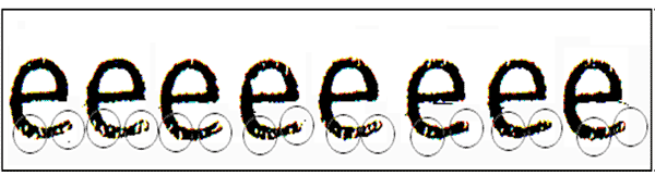
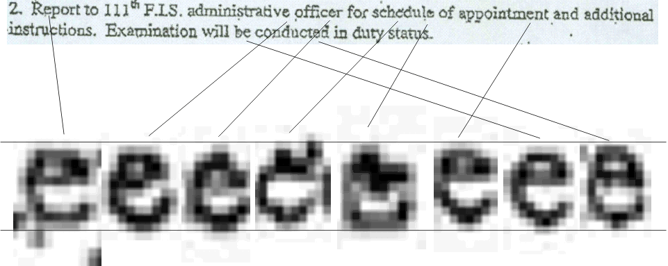
Hailey's Figure 10 shown here claims to show consistent type damage on high-resolution scans of a document that was typed on a Selectric typewriter. He claims that the highlighted areas show the "wear" that indicates a genuine typewriter. However, he seems to emphasize certain circled areas which he claims illustrate this wear, and for some reason conveniently ignores the other areas. I recommend that the reader look at the image to the left, and study the top of the "e". Note that there are equally significant but inconsistent "wear" marks at the top of the "e". Look at the shape of the interior of the top of the fourth "e" from the left. No other "e" has this "wear" characteristic. Look at the horizontal bars. They are also inconsistent. This would not be true if the letters were showing consistent wear. If you look carefully, you will see that the highlighted areas are also inconsistent. And this purports to be from a document that was typed on a single typewriter. There are so many differences that it is easier to attribute these to irregularities in the ribbon, or possibly irregularities in the paper, or perhaps, given the unknown age of the document, even wear on the carbon ribbon image over time. Here's another image I made from his "high contrast" image.
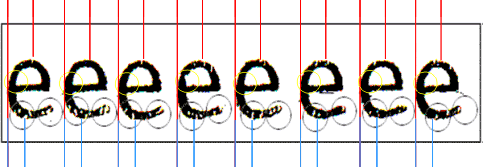
Let me describe what is going on here. I first pasted his sequence-of-e image into PowerPoint, and dragged it to a large size, maintaining aspect ratio. Along the top, I have started out with a pair of red lines. The first line is aligned with the left edge of the character, the second with a large defect in the top of the "e". I then grouped these two lines, in PowerPoint, then copied and pasted them once per each "e". In the second image, there is no defect that corresponds to the first. In the third "e", the defect is significantly to the left of the line. In the fourth, there are three defects, one greatly to the left of the red line, one slightly to the right, and one very large one quite far to the right. In the fifth image, there is a colored defect to the right of the line. In the sixth image, I see several possible defects, only one of which is near the line. In the seventh image, only one defect appears far to the left of the red line. And in the eighth image, there are at least three construable defects, none near the red line.
I repeated the experiment with two blue lines at the bottom, finding an equal lack of correlation. Note that the irregular size of the lines is a consequence of pixelization during the copy from PowerPoint into the GIF file used for this illustration. But you can repeat the exact same experiment.
I then took a look at the area I circled in yellow, the lower left corner of the interior top of the "e". I see substantial differences in the appearance of the "e". And this is from a high resolution image of Selectric (apparently fixed-pitch) output.
I fail to see what this says about worn type. It may say a lot about the longevity or precision of carbon ribbon, or something about the paper, but I see no evidence of type wear from this image. There is too little correlation with the defects. A good image processing algorithm could attempt to correlate the defects in each "e", but I frankly do not care to waste my time proving what is completely evident, that this piece of legerdemain has nothing to do with the actual topic under discussion. It is a poor experiment, proving nothing.
It would be interesting to study a number of well-used Selectric typeballs to see what the actual wear patterns are, by physical examination of the typeballs themselves. Then, having measured the actual wear patterns on a set of typeballs, a controlled experiment using the selection of typeballs on a single Selectric typewriter, and then comparing the patterns of Selectric typeballs across a selection of Selectric typewriters, could be an interesting experiment. For example, for those who have not used a Selectric typewriter, the ball had several axes of motion. There was a rotation along the vertical axis, that selected one of several columns within a 180º segment of the typeball. There was then an additional rotation on an axis parallel to the platen which selected one of the characters in that column. And there was a 180º rotation induced by the use of the Shift key, which selected the upper-case character set. Note that each of these required very precise registration of several interacting moving parts, all of which are subject to wear. So even if artifacts of "wear" appear, it is not clear if they are due to the wear on the typeball itself, or wear on the underlying mechanisms that manipulate the typeball.
Rotational errors on the vertical axis would show consistent errors along a column of characters. Rotational errors along the axis parallel to the platen would show consistent errors along all the characters at the same latitude. Rotational errors along the shift rotation would show consistent errors between shifted and unshifted characters. Errors in the striking mechanism would have to be evaluated in terms of the character position on the typeball, and would interact with errors from all the previous sources as well as errors caused by a "worn platen" (I can get access to a typewriter which dates to the 1940s, and which was heavily used for many years, and it would be interesting to see how "worn" its platen is). Yet by examining a single character from an IBM Selectric sample, Hailey asserts that the anomalies are due entirely to wear on that character alone. There is not enough experimental evidence to support this. We are furthermore to assume that the inconsistent anomalies shown in his illustration "prove" that the "e" character is worn because of its frequent use, apparently because he says it is.
So the issues of wear include several components, including the accounting for the nature of the rotational and striking model. Also, it would be important to perform the experiment having removed and replaced, accounting for possible errors due to wear or slight misregistration of the typeball each time it is installed. All we see in the above example is one experiment, with one typeball, on one typewriter, with one installation of the typeball. Generalizing from this to a non-Selectric typewriter does not seem possible, and it is well-established that the only Selectric typewriters available at TANG were monospaced, which rules them out as candidates for the Bush memos.
A more compelling argument might have been made using actual IBM Executive type fonts, from an actual IBM Executive typewriter, noting what the characteristics of type misalignment would be. A few dozen IBM Executive typewriters would be a nice starting sample, but that experiment was not considered. Again, the relevance of such a test is questionable, since it is stated that no IBM Executive typewriter existed at the TANG office which is the office of origin of these memos, and my analysis demonstrates that if one did, it would almost certainly not produce output that resembled the CBS memos.
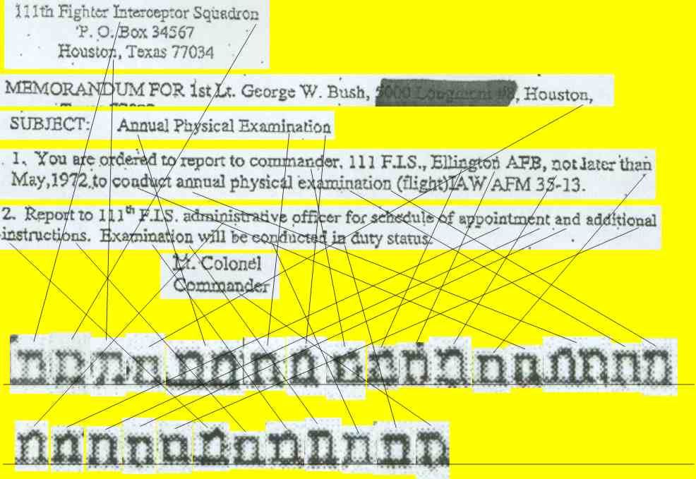
Nonetheless, based on these tiny differences, Hailey infers that the it is possible to demonstrate that the type is damaged in some consistent way for some set of letters. I decided to try an actual experiment on the document, using another letter, the letter "n", to see if I could detect similar damage based on such fine-grain analysis. The image at the left was created by copying the pieces from the 04-May-1972 memo (just to save some image space), then going back to my printed and scanned image of the CBS PDF file of the memo and extracting the letters. I then pasted each "n" down at the bottom, somewhat magnified. All images are direct pastes with no attempt to "clean up" or "resize" them. I aligned them along a line as best I could. I then drew connecting lines from each "n" in the original to the corresponding larger "n" in the samples, to show where each came from.
(It is worth noting that in several cases Hailey extracts individual letters from the memos to prove a point, but fails to give a precise citation. Perhaps he is not aware that in scientific research, if you cite a document, you must give a proper citation. I have tried to cite in all my samples where I got the information I'm comparing).
This image was derived from the CBS PDF file, which I printed on my Xerox N4025 laser printer at 1200dpi, from Adobe Acrobat, and then scanned in with my MicroTek ScanMaker 6800 at 600dpi optical resolution.
Remember, you too can conduct this experiment. Nothing magic, nothing funny, nothing dealing with resizing, contrast enhancement, or any similar technique. Just snip each "n" out of the memo and place them side-by-side as I did. Now, from the samples of "n", I would appreciate if someone could consistently identify a failure mode that indicates a form of damaged type, platen wear, or mechanical defect, such that it is clear that each of these "n"s was typed on the same typewriter.
Each "n" shows various imperfections, quite different in some cases. Note that some, for example, show a missing spot in the left vertical, and some show a missing spot in the right vertical. Some have square tops, some have round tops. Some have thick serifs, some have thin serifs. Some verticals are thin, some verticals are thick. Some tops even have more pronounced roundness than others. It is hard to believe that this wide variation could be accounted for by a consistent defect in a physical mechanism.
Now let's revisit the "worn font" problem again. Hailey states, following what is labeled Figure 10 in my printout of his site, "By comparing each apparently damaged character to its neighbors, I was able to determine that the "t's" demonstrate the same pattern of damage or wear throughout all of the documents".
I wonder what documents he was using. Certainly not the same set I have, the ones from the CBS Web site.
Here's my experiment. This was done by clipping the "t" characters out of the TIFF format file exported by Adobe Acrobat for the 01-August-1972 memo. I enlarged the first "t" to get a large image, placed two lines across it, and then expanded all the other "t" characters to match the height as best I could. Examine this figure:
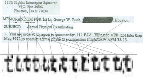
Note that there are several odd forms of "wear". Given that Hailey has not demonstrated with the "e" that his metric of "wear" is meaningful, he then extrapolates to a completely different domain, low-resolution digitized images, then immediately jumps to an erroneous conclusion. The "t" contains fine detail in its crossbar. Therefore, under pixelization, particularly low-resolution, these details will be lost. I would appreciate if someone could find a consistent pattern of "wear" in the images I show, and which you, too, can see in your very own copy of the CBS documents. I stopped when I filled the line of enlarged "t" characters, rather than continuing to a second line, because I am getting tired of demonstrating the obvious. I see no convincing evidence of any sort of type wear here. If the simulated wear he induced (apparently with something like PhotoShop) that he shows in his Figure 11 (as numbered in my copy of his document), then we would see something more like the second "t" in all the images. But we do not. Yet he claims "the same pattern of damage or wear throughout all [emphasis mine] of the documents". What documents? Certainly he was examining a different set of documents that I have, or you can download from the CBS Web site. In the samples on the left, his assertion about the same pattern of wear is so conclusively disproved within a single document that there is no need to waste time examining any other document.
You can do the same experiment from letters clipped from the printed image, which I did with the "n", and get similar inconsistencies. Therefore, I believe I have done a scientifically controlled experiment, demonstrating that using two approaches (scanned printed image, direct TIFF extraction) to test the same hypothesis produce similar results, and the hypothesis that a TIFF file will show something meaningfully different in this respect from a scanned, printed image, is disproved. While there are certainly differences, as an inspection of the "t" and "n" samples show, the important feature, the inconsistency of the characters, is clear in both representations. Therefore, it is clear that the resolution of the documents makes it impossible to make any statements about "wear" on the characters.
Let's look at the pixelization problem scientifically, instead of ignoring it, as he has. I did a few experiments.
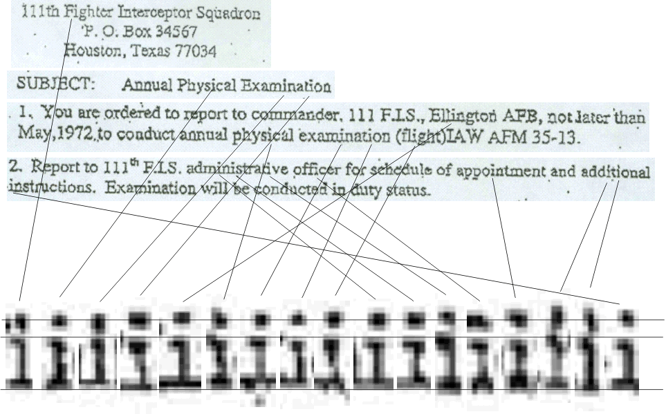
To do this experiment in a scientific manner, I placed a ruler down and measured one-inch segments of lines in the 04-May-1972 memo. I did not count a character that fell in any part past the 1-inch mark as valid, so there is a tendency to be somewhat skewed to giving a half-letter-smaller value, but within the limits of error I have some interesting numbers. I get the data shown below. The last two columns were the result of pasting the data of character counts ("Chars") into an Excel spreadsheet, computing the formula =100/A1 for the pixels/char and then replicating it for the 10 rows. I then asked Excel to compute statistics: This is done by Tools > Data Analysis, and in the resulting dialog, selecting the option "Descriptive Statistics". In the dialog that comes up I specified the pixels/char range A1..A10, Specified the output range to be D13 (which placed the statistics in two columns starting at D13 and E13, asking for "Summary Statistics", and the "Confidence level" for "95%". Note that I have detailed every step of this analysis so you, too, can do it.
| Line | Text | Chars | Pixels/Char (100dpi) | Statistic (Pixels/Char, 100 dpi) | Value |
| para 1, line 2 | USAF/TexAN | 10 | 10.0 | Mean | 7.50 |
| para 1, line 1 | suspended fro | 12 | 8.3 | Standard Error | 0.37 |
| para 2, line 1 | to commander | 12 | 8.3 | Median | 7.14 |
| para 2, line 2 | flight review b | 15 | 6.7 | Mode | 7.14 |
| para 3, line 1 | transfer of this<space> | 17 | 5.8 | Standard Deviation | 1.16 |
| para 3, line 4 | including assi | 14 | 7.1 | Sample variance | 1.34 |
| para 4, line 2 | qualified Vietn | 15 | 6.7 | Kurtosis | 1.48 |
| para 4, line 3 | received but n | 14 | 7.1 | Skewness | 1.01 |
| para 3, line 1 | 9921 st Air Re | 14 | 7.1 | Range | 4.12 |
| para 3, line 3 | physical Offi | 13 | 7.7 | Minimum | 5.88 |
| Sum | 136 | Maximum | 10.00 | ||
| Average | 13.6 | Sum | 75.00 | ||
| Count | 10.00 | ||||
| Confidence Level (95%) | 0.83 |
Note that we have, at 100dpi, an average of only 7.5 pixels per character. Yet Hailey, in his analysis, is looking at details far finer than 1/8 of an average character, and ignoring fundamental information theory in leaping to unwarranted conclusions.
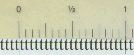 Consider the image to the left.
I placed down a sequence of "t" characters, in Times New Roman, 12pt, using
Microsoft Word 2000. I printed the page out on a Xerox N4025 printer at 1200dpi,
taped a plastic ruler to it, scanned it in using a MicroTek 6800 ScanMaker at
600dpi optical, dropped it into PowerPoint, added the extended lines coming down
from the ruler, clipped the image to reduce the useless area I had scanned, and
then saved it as a GIF file (I am being very precise about what I did so
anyone can replicate my experiment).
Consider the image to the left.
I placed down a sequence of "t" characters, in Times New Roman, 12pt, using
Microsoft Word 2000. I printed the page out on a Xerox N4025 printer at 1200dpi,
taped a plastic ruler to it, scanned it in using a MicroTek 6800 ScanMaker at
600dpi optical, dropped it into PowerPoint, added the extended lines coming down
from the ruler, clipped the image to reduce the useless area I had scanned, and
then saved it as a GIF file (I am being very precise about what I did so
anyone can replicate my experiment).
I count approximately 21.5 "t" characters in one inch (in this case, I chose to round to the nearest half-character, reducing my error bound, because it was easy to see the fractional character in the enlarged image). That is, if this document were transmitted by 100dpi fax, we would have 21.5 characters across 100 pixels. This gives me 4.65 pixels per "t". Yet, given this horrendous resolution, Hailey claims to be able to distinguish wear!
![]() Just to demonstrate how
completely absurd this is, I took one of the letters from the 600 dpi scan of my
Word example, blew it up to a large
size, placed some lines vertically so that there were 5 evenly-spaced lines from
left to slightly beyond the right. I used the "distribute horizontally" function
of PowerPoint to spread these out. I fiddled with the rightmost line until I saw
approximately 2/3 of a horizontal unit representing the
rightmost side of the "t". I then grouped the vertical lines, copied them,
pasted them, flipped them 90º, did another copy and
paste, aligned the two groups so a line at the edge overlapped, pasted again,
ungrouped, dropped a few unnecessary lines, regrouped the rest, and aligned them
with the first two. This gave me an approximate grid. Note that this would
represent the pixelization of 100dpi. I then created two more copies of the
600dpi "t"
image, placing them to the right, and extended the horizontal lines. I made two
more copies of the vertical lines and placed them, and then I slightly
misaligned the second and third "t" to show what could happen with pixelization
at 100dpi.
Just to demonstrate how
completely absurd this is, I took one of the letters from the 600 dpi scan of my
Word example, blew it up to a large
size, placed some lines vertically so that there were 5 evenly-spaced lines from
left to slightly beyond the right. I used the "distribute horizontally" function
of PowerPoint to spread these out. I fiddled with the rightmost line until I saw
approximately 2/3 of a horizontal unit representing the
rightmost side of the "t". I then grouped the vertical lines, copied them,
pasted them, flipped them 90º, did another copy and
paste, aligned the two groups so a line at the edge overlapped, pasted again,
ungrouped, dropped a few unnecessary lines, regrouped the rest, and aligned them
with the first two. This gave me an approximate grid. Note that this would
represent the pixelization of 100dpi. I then created two more copies of the
600dpi "t"
image, placing them to the right, and extended the horizontal lines. I made two
more copies of the vertical lines and placed them, and then I slightly
misaligned the second and third "t" to show what could happen with pixelization
at 100dpi.
Consider some artifacts of the "t", the sloping line from the left of the horizontal bar to the top of the "t", and the horizontal bar itself. In the leftmost image, the horizontal bar is entirely contained in the row, and would create a single row. The leftmost item is fairly dense, perhaps 85% black. The next box over is probably 95% black. The third box over is probably 85% black again. The fourth box over is probably 80% black, and the last box, if it only involved the "t" character shown, would be perhaps 10% black. But this same pixel has part of the horizontal bar of the next "t" in it, so it might be considered 20% black. All of these are visual "rough estimates" to set an example; while I could use spot photometry to give more accurate results, but I am only trying to illustrate a point here, not give precise measures. The scanner has already done that. Once you start seeing the pixelization effects, you realize that "wear" is not discernable at the level he claims to be able to see it, because it could easily be masked by pixelization. Examine the two other "t" characters, which I offset slightly in the grid, to see that they would have different appearances. Of course, this assumes the scanner actually gives a meaningful rendering of the actual density, and not an approximation, or a nonlinear approximation.
Note that even at 200dpi, we would see some errors.
But then, when I compare a "t" from the memos, which I show on the far left (this particular "t" is from the "t" in "Houston" in the document heading of the 04-May-1972), I see that the features in it are approximately 2/3 the size of my grid lines. This leads me to conclude that the fax may have been sent at 150 dpi. OK, this is science, not opinion, so I rework my spreadsheet to give the statistics at 150dpi. In this case, I put the dpi resolution into a specific cell in the spreadsheet, such as C2, and created the formula for the pixels per char as being =$C$2/A1, and replicated the formula (the use of the $ keeps Excel from advancing the row or column as the formula is replicated into other cells).
| Line | Text | Chars | Pixels/Char (150dpi) | Statistic (Pixels/Char, 150 dpi) | Value |
| para 1, line 2 | USAF/TexAN | 10 | 15.0 | Mean | 11.25 |
| para 1, line 1 | suspended fro | 12 | 12.5 | Standard Error | 0.55 |
| para 2, line 1 | to commander | 12 | 12.5 | Median | 10.71 |
| para 2, line 2 | flight review b | 15 | 10.0 | Mode | 10.71 |
| para 3, line 1 | transfer of this<space> | 17 | 8.8 | Standard Deviation | 1.74 |
| para 3, line 4 | including assi | 14 | 10.7 | Sample variance | 3.02 |
| para 4, line 2 | qualified Vietn | 15 | 10.0 | Kurtosis | 1.48 |
| para 4, line 3 | received but n | 14 | 10.7 | Skewness | 1.01 |
| para 3, line 1 | 9921 st Air Re | 14 | 10.7 | Range | 6.18 |
| para 3, line 3 | physical Offi | 13 | 11.5 | Minimum | 8.82 |
| Sum | 136 | Maximum | 10.00 | ||
| Average | 13.6 | Sum | 75.00 | ||
| Count | 10.00 | ||||
| Confidence Level (95%) | 0.83 |
![]() This
is what science is all about. Now I can correct my working hypothesis that we
have an image scanned at 100dpi, and say with some greater confidence that we
have an image that was faxed at 150dpi. Re-examining the sequence of "t"
characters, we have 6.97 pixels per "t". That's close to 7 pixels. So I reworked
my diagram to display 7 pixels (I realize that I'm being tedious here, but
someone who doesn't know how science is done might be reading this, and might
learn something about actual scientific research as performed by actual
scientists, and this might be an inspiration to, say, a high-school student, to
go on into science).
This
is what science is all about. Now I can correct my working hypothesis that we
have an image scanned at 100dpi, and say with some greater confidence that we
have an image that was faxed at 150dpi. Re-examining the sequence of "t"
characters, we have 6.97 pixels per "t". That's close to 7 pixels. So I reworked
my diagram to display 7 pixels (I realize that I'm being tedious here, but
someone who doesn't know how science is done might be reading this, and might
learn something about actual scientific research as performed by actual
scientists, and this might be an inspiration to, say, a high-school student, to
go on into science).
Note the different levels of black squares in the CBS memo, reflecting the issues of pixelization.
There is one anomaly in the image to the left; it looks more like I've lost a bit of precision and the "t" character is more like 6.6, rather than 7. Also, the features do not seem to be precisely lined up on the grid lines. They were precise in the original PowerPoint image. This apparently is the result of the conversion of the PowerPoint image to GIF format by way of a copy and paste into Corel PhotoPaint, which seems to have errors in rendering the metafile. But I decided to not create a super-high-resolution image that took ten minutes to download. But remember, you too can perform this experiment and see for yourself!
We have learned something important here! We now know that this document appears to have a resolution of 150dpi.
Notice that we still have no way to discern the "wear" that Hailey so confidently says exists!
I have not bothered to determine the scanning resolution of the other memos. Now that I have completely described the method for determining it, anyone else is free to make the same measurements and come to their own conclusions.
I therefore conclude that the "differences" which Hailey attributes to errors in the physical type can easily be accounted for by pixel quantization and therefore his analysis is flawed, and his conclusions are without basis.
A little-known feature of the U.S.S.R. under Communism was that when someone purchased a typewriter, it was delivered to the local police office. The people there took a razor blade and nicked various characters, then registered the owner, the serial number of the typewriter, and a complete sample of the typewritten output. Since the characters exhibited consistent errors, if a samizdat appeared, all that was necessary would be to compare the characters in the document in question with known samples from the registered typewriters, and the offending typewriter could be identified. This analysis required that the expected behavior, that characters always exhibited consistent defects, would be true. The government could at any time come in and type a new sample, and it was a crime to in any way have modified the type so that the type did not correspond to the "standard sample" for that typewriter. Since the government was not overly concerned with niceties of law we take for granted, anyone associated with, or who might have had access to, that typewriter could find themselves winning an all-expense-paid trip to the nearest gulag.
Dr. Hailey states:
"Seldom used characters such as numbers, capitals, and the lower case "o", "q" and "p" (and the other less used lower case characters) show no signs of damage."
Well, it seems superfluous, but I actually did my study of "o" characters from the memo. I didn't do all of them, because it seemed pointless, but I did more than I did with the "t" example only to emphasize the point. Remember, this is what he was looking at when he wrote that statement. This is what I was looking at. And this is what you, too, can look at. Please, please show me how these pictures say anything about "wear", and how they show that the "o" is not worn.
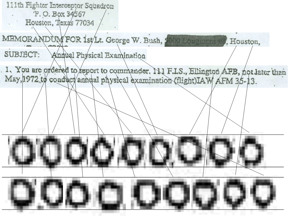
It is only necessary to study the center of each "o" character to realize that the artifacts of the scanning process completely dominate, and subtle differences like "wear" would be completely masked.
He presents his assertion without any justification; apparently we are supposed to merely trust his statement. But you can perform this experiment for yourself, examining each "o" character, and determine that wear could not possibly be determined.
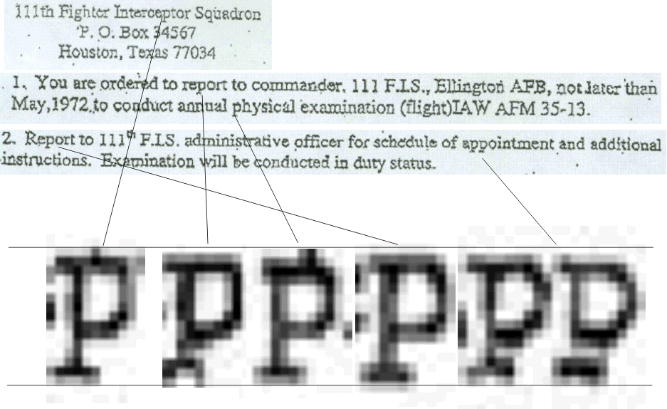
Again, just from the 04-May-1972 memo, I have extracted the "p" characters which he claims show no signs of wear. There are fewer of these so I could use an even larger magnification. Now, if someone showed you these images and said "the "p" characters show no signs of wear", what would you deduce? Yet Dr. Hailey makes his assertion from the very same data I am using.

 Finally,
we examine the assertion that the "q" shows no wear. This is the "q"
taken from the word "Squadron" in the heading. Can you deduce from this
image that the "q" shows no wear? I do not even feel compelled to waste time
extracting a "q" from other documents. The resolution here is far too low to
detect anything that subtle.
Finally,
we examine the assertion that the "q" shows no wear. This is the "q"
taken from the word "Squadron" in the heading. Can you deduce from this
image that the "q" shows no wear? I do not even feel compelled to waste time
extracting a "q" from other documents. The resolution here is far too low to
detect anything that subtle.
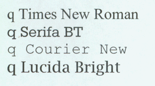
In fact, given only this letter out of context, it is an interesting exercise to look at several other "q" characters in different fonts (as I indicate elsewhere, I do not wish to spend $179 to get the typewriter fonts he used, and I have very little comparable on my machine). I chose two serif fonts, Serifa BT an the old standard, Courier New. I then chose two other fonts, the postulated matching font, Times New Roman, and one called Lucida Bright. I had many other examples, but I am not trying to prove a particular digital font could have been used, only that the documents in question could certainly have not been produced by readily-available technology of the period, at least that would be found an a typical office.
I think I could say with a certain degree of confidence that it might not be Serifa BT or Courier New, but I think it is problematic to tell if it is Times New Roman or Lucida Bright. I base this guess on the fact that there is apparently no serif on the ascender on the top right.
I would have found it interesting if Hailey had actually done the study his title suggests, instead of the poor attempt to demonstrate the documents "were typed on a typewriter".
When I did my comparisons to characters, I worked with larger samples, looking at intercharacter relationships, overall word shapes, and the grosser features. Then, having established that large features matched, I could examine, to within the limits of error, the finer features such as the pseudo-kerning, or intercharacter spacing. But as to whether that "q" is worn, his assertion is not proven based on available data. I could search for instances of "q" in other documents, but given the poor quality, and the ready differences easily seen in the "p" characters, I am not tempted to waste more time on discussing individual characters taken out of context.
I leave it as an Exercise For The Reader to examine in these documents all the capital letters, such as the "E", "F" or "S" characters, and come to your own conclusion as to whether these characters show less "wear" than the "e" characters.
4. The quality of individual characters is inconsistent throughout the memos beyond expectations from photocopying and/or digitizing but quality is consistent with worn platen and variations in paper quality
See my discussion of "wear" to realize that the quality of individual characters is well within the expectations from photocopying and faxing. Given that if the differences were due entirely to worn platen and variations in paper quality, we would have seen completely consistent representations of "n", "o", "p", and "t" within a single document, and if they were typed on the same device, these errors would be consistent from document to document. But the wide variation within even a single document makes comparisons between documents meaningless.
In addition, there is no evidence to suggest that the inconsistent quality would exist with an actual typed document. Since I have not used a typewriter except under duress since about 1968, my own electric typewriter (which has a very unusual font in any case) has not been turned on in over 35 years, and I'm not even sure I remember where it is. But in the absence of any proof that such inconsistency exists, I do not follow the leap of logic that indicates that the quality is consistent with worn platen and variations in paper quality. This assertion is made without any proof.
This assertion is without basis, and therefore without merit.
In his Figure 15 (according to the numbering in my copy), he makes assertions about the striking of one character "deforming the paper" so that another character is not completely typed. How he is able to infer this from the 150dpi resolution is not demonstrated. He has not shown a high-resolution scan of an actual typed document, produced on any typewriter, showing such effects. He does not cite any source that discusses this possibility. While this remains an interesting theory, there is no evidence to back it up. I would expect to see a truly scientifically conducted experiment that could confirm or refute this theory, but exactly how to make the leap from the available data to a conclusion based on such a low-resolution image remains a mystery.
To substantiate this theory, he provides several images from some unknown collection of memos, a carefully selected set, and somehow believes that these are "proof". I see no proof here. I do see an unproven hypothesis, but to present this as if it were a fact is poor science. It would have made sense to say "I suggest that these examples are caused by...", which he states in his discussion, but he states flatly that these artifacts are true, in point 5 of his abstract.
He is anxious to state that "CBS (and Mr. Rather and his producers) justifiably believed the documents to be authentic". Even though they had been advised that the documents might not be. He further states "Given enough time and concentration, any competent "expert" would have concluded that they are typed in a font commonly used in the military at the time". I seriously doubt this. Many competent experts have examined these documents, and have concluded quite the opposite. There is an implication here that anyone who disagrees with his opinions is incompetent. Not only are there competent experts on font technology, but competent experts on signatures, competent experts on document forms used by the military in 1972, and competent experts on military terminology used in 1972. There seems to be uniform agreement among these competent experts that, in their own areas of expertise, there is something seriously wrong with the documents.
The font hypothesized, perhaps fondly dreamed of, by a number of people appears to have not existed; even if the letter forms existed, there is no evidence to suggest that any machine available at TANG, or possibly available at all, was capable of laying those letter forms down in a spacing that precisely mimics the form in which Microsoft Word lays those forms down. Looking at letter forms out of context is insufficient evidence that the document could have been created by any device that actually used those letter forms.
"There is currently outside evidence indicating that the documents are inauthentic, but none of it exists in the mechanics of documents themselves". I think the 1:1 correspondence with a Microsoft Word document is a fairly compelling argument about the mechanics of the documents themselves. The presence of such features as the pseudo-kerning, and the unlikely possibility that such pseudo-kerning would exactly match that of the Times New Roman font, seem so unlikely as to be easily considered to be zero-probability events.
I have written extensively, both in this document, and in my earlier analysis, on what he calls the "mechanics of the documents themselves". I find the evidence compelling that the documents were created using Microsoft Word using Times New Roman. At no point does he refute any point I made, or demonstrate that my methodology is flawed. However, anyone is free to read these documents, and question what I have done. And anyone should be able to replicate the experiments I have shown.
"I am convinced, in the end, it will be generally recognized that the documents CBS released to the public were typed -- probably on an old, military typewriter". I think anyone who has taken the time to examine the documents in their entirety, instead of one letter at a time in isolation, recognizes that these documents could not have been produced by any typing device of the time that would have been in use at TANG, and thus far no one has produced any evidence of the existence of any typewriter-like device that could produce these documents. I exclude from this discussion all professional typesetting equipment; the use of such equipment to create an internal personal memo, or any other document that we have seen, is so unlikely that the possibility is not worth considering.
"In one case, the author assumes that the document was done in Times New Roman and continues by assuming he can recreate the proportions of the memos". He continues to explain, in detail, the mechanics of how a copier works. But then he states "These are all mechanical processes, and anybody with extensive experience knows that these processes change the proportions of the copy. It might be shorter, or longer, or narrower, or wider. Even the relationships between characters change. If we do not know anything else, we know that if you placed these photocopied memos on top of the original they would not line up".
Wow! What a description! In my comparison, there are some tiny errors in the vertical alignment, which I can attribute to slight errors in the scanning. I have even accounted for this by realizing that since most printers, scanners, and fax machines scan documents vertically (the scan reads the short dimension while the document moves along its long dimension). What is amazing to me is that in spite of the photocopying, faxing, scanning, document conversion, download, print conversion, and actual printing, the printed documents I produce show a shockingly precise similarity to the documents I can produce, directly, on my laser printer using Microsoft Word. I produced the CBS document on my Xerox N4025 laser printer, but I have no transparency material for that printer; so I printed the transparency on my Tektronix 740 color laser printer, and it still registers.
Interestingly enough, this leads to an entire discussion I was fully prepared to do, in my first report, on nonlinear artifacts, including center-to-edge nonlinearities, edge-to-edge spread, vertical tracking errors, and so on. I was extremely surprised that I did not actually need to have this discussion. How, exactly, the relationships between characters are changed by this process is left unstated by Hailey, but as someone who understands the workings of laser printers, and even copiers (I was using laser printers, as I characterize it "before they had lasers", and the XGP had a systematic error-of-curvature because the imaging CRT was a flat CRT, but the scanning beam traversed an arc; it was a one-dimensional example of the distortions of a Mercator projection along the north-south axis. So I am not ignorant of the artifacts he describes). Note, however, that the presence of systematic errors does not invalidate a result, as any competent physicist can explain. I was trained as a scientist by a physicist. I understand experimental methodology, accounting for errors, error bounds, nonlinear transformations, and coordinate spaces. However, it is also a well-known that if you can apply a simple equation, or set of equations, to a set of values in one coordinate space, and arrive at an isomorphism with a corresponding set of values in a different coordinate space, then the two entities are isomorphic, that is, the same.
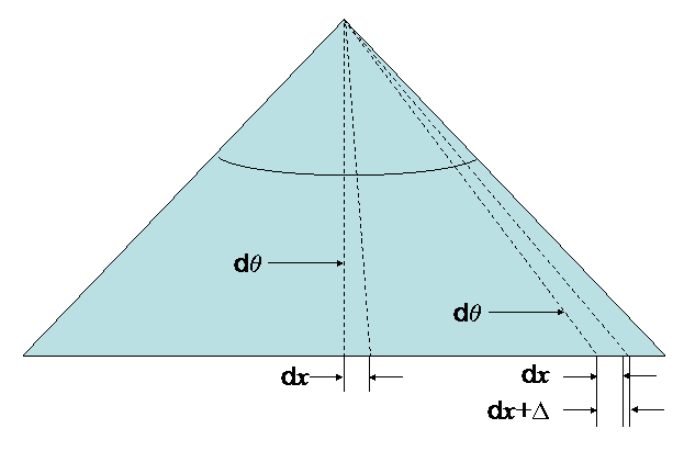 To demonstrate that I both know what he is talking about, and know how to
compensate for the errors. examine the accompanying illustration of the XGP, the
prototype of the "laser printer" that used a flat-faced cathode-ray-tube (CRT)
to image the pixels. An optical system then caused these to hit a xerographic
drum, and the familiar xerographic printer process proceeded from there. The
electronics of the XGP swept the CRT beam through a certain angle, linearly,
from edge to edge. At the "horizontal retrace" event, the beam swept to one side
of the tube, which for our purposes we can assume to be the left of the
accompanying image. Then, if we consider the 8½
inches of the sweep across the page, and allowing a little bit of border at each
end, at a resolution of 183 pixels/inch, it would sweep through perhaps 1500
points at a certain rate (covering 8.2 inches), which is the angle-per-unit-time, expressed in
degrees/second. Now consider two pixels--perhaps the first pixel is the start of
one character and the other pixel is the start of the next character. When this
occurs near the center of the page, we get a different effect than if these two
characters are drawn at the edge. When the beam
sweeps between these two pixels, it sweeps at an angle
q during some time dT. At the far end, it sweeps
the same angle q during the same
dT. But because of the angular displacement, we find that the horizontal
space scanned on the flat-screen CRT is not the distance dx swept
in the center, but a wider distance dx+D.
By simple high-school arithmetic, the actual difference could be computed, once the
angles relative to the normal to the CRT surface. Or, knowing the value of
D, and the sweep width, we could compute the
angle of displacement.
To demonstrate that I both know what he is talking about, and know how to
compensate for the errors. examine the accompanying illustration of the XGP, the
prototype of the "laser printer" that used a flat-faced cathode-ray-tube (CRT)
to image the pixels. An optical system then caused these to hit a xerographic
drum, and the familiar xerographic printer process proceeded from there. The
electronics of the XGP swept the CRT beam through a certain angle, linearly,
from edge to edge. At the "horizontal retrace" event, the beam swept to one side
of the tube, which for our purposes we can assume to be the left of the
accompanying image. Then, if we consider the 8½
inches of the sweep across the page, and allowing a little bit of border at each
end, at a resolution of 183 pixels/inch, it would sweep through perhaps 1500
points at a certain rate (covering 8.2 inches), which is the angle-per-unit-time, expressed in
degrees/second. Now consider two pixels--perhaps the first pixel is the start of
one character and the other pixel is the start of the next character. When this
occurs near the center of the page, we get a different effect than if these two
characters are drawn at the edge. When the beam
sweeps between these two pixels, it sweeps at an angle
q during some time dT. At the far end, it sweeps
the same angle q during the same
dT. But because of the angular displacement, we find that the horizontal
space scanned on the flat-screen CRT is not the distance dx swept
in the center, but a wider distance dx+D.
By simple high-school arithmetic, the actual difference could be computed, once the
angles relative to the normal to the CRT surface. Or, knowing the value of
D, and the sweep width, we could compute the
angle of displacement.
 Because
of these nonlinearities, the XGP turned out to be
unusable for doing something like making a printed circuit board master, because
the horizontal-relative spacing of the holes would be different on the edges of
the image than in the center. It would be possible that any copier or laser
printer could introduce similar artifacts, which is what Hailey is suggesting.
He apparently thinks that the introduction of such artifacts would invalidate an
analysis, but merely computing the inverse function would demonstrate
equivalence. Thus his argument in this respect is without merit.
Because
of these nonlinearities, the XGP turned out to be
unusable for doing something like making a printed circuit board master, because
the horizontal-relative spacing of the holes would be different on the edges of
the image than in the center. It would be possible that any copier or laser
printer could introduce similar artifacts, which is what Hailey is suggesting.
He apparently thinks that the introduction of such artifacts would invalidate an
analysis, but merely computing the inverse function would demonstrate
equivalence. Thus his argument in this respect is without merit.
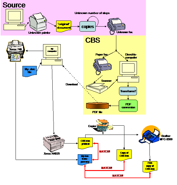
Just to prove that I actually do understand what has been going on along these paths, I include a picture. We presume the source is a Word document. It was printed on an unknown printer. The document went through some number of copy steps, zero or more, and was then faxed to CBS. CBS implemented one of two possible methods: either the document was received by a paper-producing fax and scanned, or was received directly into a computer. From the fax representation, through some number of unknown steps, a PDF version of the document was created. I downloaded the PDF file to my computer. I printed the document on my Xerox N4025 and got a document. I created a Microsoft Word file, and printed it on my Tektronix 740 color laser printer. The transparency, when placed over the CBS document, shows no significant differences. I then copied the CBS document output from my printer through a 17-year-old Canon PC-25 copier, and got a new copy. Placing the transparency over the copy showed no significant differences. I then took the CBS document output, ran it through my Brother MFC-8500 fax machine in "copy" mode, and got another document. Placing the transparency over this copy again shows no significant differences.
I therefore state, with scientific evidence in hand, that the hypothesis that distortions through the many levels of copying in fact is disproved, and his concerns are irrelevant. If I had seen distortions, it would only be necessary to describe the transfer function involved to show identity to isomorphism under transformation, and this would still make any conclusions reached by this means valid, so his concerns would have a meaningful response, which would in no way invalidate the results that I, and dozens (perhaps, by this time, hundreds) of other people have been able to reproduce.
"For a person to begin by assuming that he is dealing with Times New Roman and then continue with the assumption that he can successfully divine the proportions is not unlike presenting the argument that the earth is the center of the universe, beginning with the untested argument that the earth is flat and that the author can divine its dimensions. In fact, if the author doesn't know the earth is not flat (i.e., not Times New Roman), the author clearly has no idea what the dimensions might have been".
A fascinating argument. I'm not sure what relevance it has in a scientific paper, but I would like to respond to it. Let me see if I can reword it a bit. Let me restate that: "for a person to begin by assuming that he is dealing with an actual typed document, and then continue with the assumption that he can successfully divine the proportions is not unlike..." Oh, never mind. A scientist actually starts with a hypothesis, which I did, performs a set of experiments to validate or refute the hypothesis, and arrive at a conclusion. I started with the hypothesis that the documents were modern forgeries; every test I could think of only confirmed this hypothesis. Later examination of other hypotheses, such as the IBM Executive Typewriter, the IBM Selectric Composer, and similar hypotheses, shows these hypotheses cannot be proven, and in fact, they are disproved. Hence my flat statement, "The CBS documents are forgeries". I arrived at this by testing the hypothesis. I have seen no similar validation of Hailey's hypothesis.
The essence of scientific methodology is reproducibility. In addition, certain aspects of fundamental credibility must come into play. The experiment first performed by Charles Johnson of www.littlegreenfootballs.com, and which I and many others have replicated, requires a simple path of credibility to achieve. Create a Word document. Print it out. Compare it. Arrive at your own conclusion. Or, you can take the alternative hypothesis that Dr. Hailey and many others have proposed. An unidentified typewriter with capabilities of producing a document identical to the output from Microsoft Word existed. Thus far, no one has been able to prove the existence of such a device at all; all proposed devices have been demonstrated to be incompatible with the hypothesis that such a device exists. This nonexistent device was then used by an unskilled typist to create a small number of memos, whose appearance from the viewpoint of formatting, style, terminology, and content is incompatible with known practice used by the Texas Air National Guard. No trace of this device was detectable by anyone who actually worked at TANG, including Col. Killian's secretary, who denied the existence of such a device.
It is worth pointing out for those who believe the "flat earth" theory existed are apparently ignorant of the actual history of this myth. For example, the ancient Greeks knew that the world was round, and Eratosthenes of Cyrene first measured the circumference of the Earth, with surprising accuracy. The fundamental error Columbus made was that due to erroneous information, he believed the circumference of the Earth was only 8,000 miles. The true warning was that he and his crews would die on the journey because the distance that was computed based on accurate information showed that the East Indies were far beyond the limits of the ships. Only the "accidental" presence of what became known as the West Indies (and also what became known as the Americas) saved him and his crew.
The geocentric universe was disproved by scientific measurement based on sound principles. The only previous way to account for the odd motions of planets was the epicycle theory first postulated by Ptolemy, who created more and more elaborate epicycles, sub-epicycles, and so on in a futile attempt to fit reality to his theory. Careful measurements by Nikolaus Copernicus, who did not even possess a telescope, but who postulated that the planets moved in circular orbits, formed the basis for the heliocentric theory. Unfortunately, the more complex Ptolemaic model was a better predictor of the planetary motions than the Copernican model. Extremely careful measurements by Tycho Brahe produced data which did not fit the circular orbit model. It took his student, Johannes Kepler, who came up with the simpler model of elliptical orbits. This simpler model was an accurate predictor of planetary motions, and immediately supplanted the geocentric or epicycle theories among scientists. The elliptical orbit model had a simple physical realization that could eventually be modeled by Newton's Law of Gravity (Newton was born a century after Kepler's death), and consequently the simpler explanation which had a credible mechanism and a close correspondence to reality won. Those who try to use poor analogies should be prepared to understand the consequences of the choice of such analogies.
[Note: due to a cut-and-pasto, the sentence shown underlined was omitted when I was transferring data from a sequence of slides from my course in the history of astronomy. However, rather than be accused of modifying after the fact, I have highlighted the sentence that I changed. Thanks, Eric]
He compares a number of high-resolution characters, ignores completely any issues of pixelization in the images, and draws an unwarranted conclusion.
He makes certain unsupported assertions:
1) The strokes in the text have a consistent width in both the Bush memo and the IBM font (Times characters have inconsistent width).
Take a look at my comparisons. Please identify the consistent widths in the Bush memos. Do the experiment yourself. Identify the consistent widths. There is not enough evidence in the quantized images of the CBS memos to justify this claim; therefore this assertion is without merit.
2) The serifs are heavy and have consistent weight. (The Times serifs are short spurs)
Take a look at my comparisons. Please explain how the serifs appear consistent to the fineness required to support this assertion. Do the experiment yourself. There is not enough evidence in the quantized images of the CBS memos to justify this claim; therefore, this assertion is without merit.
3) Cross strokes on the "t"s are heavy in both the memo and IBM font. (Times New Roman cross strokes are fine.)
Take a look at my comparisons. Even with a small sample within a single document, there is a variety of weights; some crossbars even have missing pieces. Look at my enlargements and study the pixelization. On what basis is it possible to claim that the image shows enough fine detail to distinguish the weight of the crossbar? Draw your own conclusion. My conclusion is that nothing in the document supports this assertion, and the assertion is without merit.
4) The bowls of the Bush and IBM "a"s are of consistent width.
He apparently deduces the consistency of the bowls (which I take to mean the lower part of the "a") based on features that are finer than the pixel quantization. (In his section of "DEFINITIONS OF TERMS USED" he does not define what a "bowl" is).
To make a valid comparison, he would need a pixel quantization that is no worse than half the dimension of the artifact he is trying to claim is valid, based on the Nyquist Limit (which was later proven mathematically by Claude Shannon) and we already know that the quantization in at least one document is far worse than that, and believe that the quantization in the other documents is comparable. Ignoring fundamental mathematical principles of information theory and then attempting to make an assertion which is unsupportable is poor methodology.
Nothing in the document substantiates this assertion; it is therefore without merit.
5) The "e"s are similarly closed in American Typewriter and the memo, and their crossbars are more dense.
He does not define what he means by "closed", and in three readings I have not found any image that illustrates this point. Therefore, this point should be dismissed. But if we assume that he has seen something in the documents which he did not state, let's do one of those comparisons. Let's just consider one small section of the 04-May-1972 document.
Show that any conclusion about the crossbars of the "e" can be deduced even with this small sample. And whether or not each "e" is "similarly closed" as in American Typewriter font. He makes an assertion which is unsubstantiated, and therefore this assertion is without merit.
6) The bottom serif in the "i" in the Bush memo is completely compatible with the IBM font. It is slab-like, and contains a comparable curve.
It is worth he says "the" not "all". I know you are probably getting bored with these comparison charts, but just look at the "i" from just the one document. Tell me what you can say about compatibility of this single letter with any given font. I notice that he does not point out that the size of the dot above the "i" is consistent with the IBM font, although it is also a meaningful comparison. Given the tremendous variation in the dot over the "i", what can you conclude about anything said about the serifs?
I also note that in the "i" in his Figure 7 (as numbered in my copy) shows evidence of "damage" because the center is lighter than the top and bottom of the character. Note that several letters below show similar "damage" ("Examination" in the SUBJECT line, "examination" in paragraph 1, "officer" in paragraph 2, and "additional" in paragraph 2. But nowhere else in the letters I show. I showed only one line of data because it demonstrates that any inferences based on consistency of serifs between two fonts based on such low resolution is stretching the imagination.
Nothing in the documents supports this assertion. It is therefore without merit.
He then derives a conclusion that flies in the face of known facts, that a digital typeface, perhaps American Typewriter, is more consistent with the CBS memos than Times New Roman. This is based on all the unsubstantiated assertions. If they are thrown out, the conclusion has no basis.
Even if the conclusion had evidence based on single-character correspondence, he has not demonstrated that an actual document created in Word, using such a font, has a better correspondence. Thus, even if the conclusion about the font family could be valid, he cannot substantiate the hypothesis that Word could produce a matching document using this font (a result that would at least be consistent with the title of his paper). And even if the hypothesis that Word, using one of the digital "typewriter" fonts, could produce an identical document, this does not lead to the conclusion that an existing typewriter of the era could produce the same document, so even if he had been able to prove any of the results he claims to have proved we still have to go back to what is perhaps the only statement he makes that I agree with fully:
"That the memos are created in an old typewriter font in no way demonstrates that they were typed"
Yet, having produced no evidence to support any of his conclusions, he is still able to state, in his abstract,
The following evidence from a forensic examination of the Bush memos indicates that they were typed on a typewriter
Well, an interesting idea. A non-typist makes no error whatsoever in typing a memo. Or, to put it another way, an expected character of a hand-typed document is missing, but a character of a word-processed document (a clean copy) does appear. A non-typist who made an error simply retypes the document from scratch each time. Or, such evidence could not be derived from a document that has undergone all these transformations. Which hypothesis is correct?
Hailey's observation presumes that such evidence could be found; of course, the correct way to determine if such evidence is findable is to use a typewriter, make a mistake, erase it, retype it, then copy the document, fax the copy, digitize it at similar low resolution, and demonstrate if such errors actually can be found.
All he says is that he found no evidence. What relevance this has to the study or its implications with respect to his conclusions are apparently left to the imagination of the reader.
I believe I have thoroughly demolished both his methodology and results in many of the preceding paragraphs.
Alas, I have to offer some opinions here that are other than scientific. I have tried to keep my descriptions technical, but this particular "proof" has such an egregious failure in methodology that I must offer a personal opinion of the methodology.
I am surprised that a person that holds the title Director, Interactive Media Research Laboratory, is unaware of pixel quantization issues. Pixel quantization is a fundamental problem that all bitmap graphics systems face. It was so well understood that it was discussed in one of the earliest books describing bitmap graphics issues, Newman and Sproull's Principles of Interactive Computer Graphics (McGraw-Hill, 1973, in particular, Chapter 3). Don Knuth discusses the problems of pixel quantization with respect to fonts in his book on MetaFont (TEX and MetaFont: New Directions in Typesetting, Digital Press, 1979, starting on page 51 of the MetaFont section). I would have assumed anyone who is discussing fonts in a digital image would be acquainted with the fundamental principles of digital fonts. Given that we have several pixel transformations (fax, scan by CBS, conversion to screen by reader, conversion to TIFF or other bitmap file by reader, conversion to pixel formats for printing by reader, to name a few, not to mention the possibility that a lossy JPEG transformation somewhere in that set) there is more than ample opportunity to see artifacts introduced, a fact which Dr. Hailey should have been aware of.
And note, I have measured it. I know that at least one of these documents has a resolution of 150dpi. And that given the average text size, the average number of pixels per character (width) is 11. But from this poor resolution, he is able to pull up a degree of detail that seems beyond credibility.
There is substantial evidence that that the presence of the "th" superscript in his "comparison" of the two documents was apparently cut-and-pasted, rather than having been produced by an actual typewriter or word processor. Exactly what this comparison is supposed to prove is uncertain, since he has at best demonstrated that an ITC typeface was used by Microsoft Word, and has demonstrated nothing relevant to the actual device which is supposed to have produced the memo in 1972. His title, "Toward Identifying The Font [my emphasis] Used in The Bush Memos" may allow him to weasel out of this, but his point seems to be to prove that the documents could have been produced on a device available in 1972. I fail to see that he has done anything other than suggest that a modern digital font other than Times New Roman might have been used.
His "111th" example, is erroneous, and inconsistent with known reality. He presents this as a "fact", when it is easily demonstrated that there is no such "fact". There is nothing more offensive to a scientist than another scientist who fakes his data. Given he has apparently faked one result, very little of the rest of his presentation could be trusted. Faking scientific results is usually considered grounds for dismissal.
I have faked nothing. Everyone can reproduce my experiments. My work is available for anyone to peer review. I have tried to meticulously detail every procedure I used.
I have taken several introductory courses on "magic", or, to be more accurate, on how to be an illusionist. The key to being a successful illusionist is to distract the audience from what you are doing by forcing them to concentrate their attention on something else. By focusing your attention on the apparent defects in the "e"s displayed, you are distracted from analyzing other parts of the "e", which can readily be seen to show different manifestations of the same type of error. And anyone who has ever worked out the "what six things are different in these two pictures" in the Sunday paper should note that in the rightmost and next-to-rightmost "e" symbols, the defects are quite different. Yet when a forensic analysis is performed on something like typewriter output from real typewriters, one of the characteristics that is closely examined is the fact that one or more characters on the typewriter exhibit consistent defects. A careful examination of any other part of the "e" shows that all of these samples exhibit largely different errors. His allegations that the memos show consistent errors has been proven false. These errors are readily explained by pixel quantization. What I see in his methodology is closer to the methods used by an illusionist than the methods used by a scientist. Further attempts to distract the reader from actual content include his appeal to the "flat earth" theory, and he has apparently gone to great effort to fit the reality to his theory, whereas the rest of us find no problem in fitting our theory to reality, and finding a very good match indeed.
The techniques of the illusionist are also well-suited to politicians. If asked a sensitive question, a politician usually responds by answering a completely different question. When someone's primary defense is not to present factual evidence, but present unfounded hypotheses as fact, misdirect the reader, leap from unwarranted assumptions to foregone conclusions, and answer questions unrelated to the original question, it is very suspicious. What, exactly, is being proven?
A scientist works by examining facts, presenting hypotheses as hypotheses, examining the facts to confirm or refute the hypotheses, designs experiments to test the hypotheses, revises the hypotheses when new data is presented or new information is deduced from the experiment, presents all of the techniques used in a way that makes it possible for others to replicate the experiment and draw their own conclusions, and ultimately reaches a conclusion based upon careful reasoning.
I conclude that Dr. Hailey's process for comparison has not only ignored many known facts about the environment, culture, syntax, and form of the documents, but is also scientifically flawed. Many of his assertions without proof are meaningless, and his conclusions, which includes the sentence "there seems to be nothing in the memos that indicates they are faked" cannot be supported by what he calls the "mechanics of the documents". The mechanics of the documents provide overwhelming evidence that his hypothesis is false. I conclude his methodology is poor, his assumptions are too often unfounded, and his evidence does not support his conclusion. He has ignored many fundamental principles of information theory, computer graphic theory (especially pixel quantization), and tends to make claims that are the opposite of what anyone in possession of the CBS files can themselves demonstrate beyond any question. He makes arguments that he claims would invalidate other studies, and at least two of these (his 111th example; transformations under copying, faxing, etc. changing the documents so comparisons are meaningless) are not only without merit, but contradicted by actual experience with the documents in question, a fact he is apparently able to ignore.
In addition, he makes statements that are either meaningless (allusions to "flat earth" legends) or designed to distract the reader from the actual issue (the damaged type examples, transformations under copying and faxing causing distortions that would invalidate any other study).
His results are erroneous, or unsupported by his methodology or his evidence. I state, as a peer reviewer of this paper, that his paper demonstrates a remarkable amount of poor scientific methodology, and ultimately in no way supports the hypothesis that these documents were typed on a physical typewriter that was in existence in 1972.
One of my correspondents [thanks, Eric] pointed out that Hailey's comparison of the "th" was probably based on the screen placement of the "th", rather than the printed representation. Of course, I would never have thought that someone who is comparing printed documents would make such a fundamental methodological error as comparing a screen representation to a printed representation. Hailey's failure to explain his methodology is clear here; he has performed an experiment that has no meaning, and from this meaningless experiment reaches a strongly-stated conclusion!
I have repeated the experiment here, taking my original image, and adding a screen snapshot of "111th" in Times New Roman, on a display that is set to 1280×1024 (which is actually a very high resolution). It is the leftmost image in the picture, below. I get the same answer Hailey got, which I demonstrate with the red line.
How he thought that comparing a screen snapshot to printer output was in any way meaningful boggles the imagination. His methodology is flawed beyond recovery, and his conclusion is therefore provably without basis because it is based on an experiment that has no relevance to the problem being discussed.
It is also worth pointing out that when I show the leftmost image, it appears to be quite fuzzy, because of the effects of scaling up the screen snapshot to be large enough to show. Yet Hailey's image is crisp and sharp, as it were a high-resolution scan of a printed image. Note that it appears to be even sharper than my own scanned image, which was done at 600dpi! This means that he is not even presenting the actual data he worked with, but instead has synthesized a different example which resembles the original data, and fails to state this. This means that he does not understand the scientific method, in which you present the actual data you have, not something that is synthesized to look good. Perhaps he wants "pretty" output instead of "scientifically accurate" output in his report.
This does not vindicate Hailey; in fact it is a serious indictment of his ability to design, perform, document, and reason about the experiments he claims to have performed.
Yet he states with complete confidence "Critics frequently point out that the superscript in the Bush Memos is identical to the superscript in Times New Roman. In fact, this is an example of people saying things without checking their facts". Of course, Hailey has demonstrated an exemplary job of checking "facts". Anyone who actually checks the facts finds that Hailey is completely wrong, in his methodology, in his analysis, in his conclusion, and in his assessment of the ability of others to check facts.
I think this establishes the baseline for the validity of his scientific method. He conducted the wrong experiment, has then presented data other than that which he used, failed to describe how he performed the experiment, and then uses this meaningless result to justify a conclusion that is the opposite of what a scientifically valid experiment produces. He then uses this conclusion as part of the justification for his broader conclusion that the document was produced by an actual typewriter!
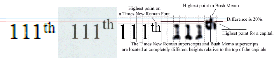
On the left: a cut-and-pasted, stretched (with aspect ratio maintained), screen representation of "111th". Second from left, a 600dpi scanned representation of a 1200dpi printed image, again stretched for display purposes. The two rightmost images are from Hailey's paper.
In copying a collection of information from my slide show on the history of astronomy, I dropped a sentence in the history. It ended up making it appear that Johannes Kepler was Copernicus's student. He was not. He was a student of Tycho Brahe, which the missing sentence clarifies. [Again, thanks, Eric]
A correspondent suggested that perhaps Hailey used a very large screen font (his assertion is 55-point) to produce the image he uses. Said correspondent also points out something well-known to anyone who understands digital fonts: nonlinear scaling invalidates any such result. If you want to say something about a 12-point font, you have to say it using a 12-point font. You can't say it using a 55-point font. Otherwise, the results can be suspect. Again, it never occurred to me that someone would perform such a bizarre experiment, not only comparing a screen font to a printer font, but comparing a screen font at a different point size to a printer font!
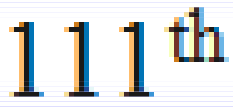 For example, note the
gray edges of the characters in my example, and the slight break (indicating
broken type) in the "h" of the "th", a bit to the right of where the curve meets
the vertical. If you examine the 12 point font on the screen with, say, a
10x magnifier (I just happen to carry one in my pocket), you see that indeed,
the font rendering engine for screen fonts has actually appears to put gray
pixels on the left and right of the vertical. The "h" discontinuity is easy
to see at even larger magnification, as shown to the left.
For example, note the
gray edges of the characters in my example, and the slight break (indicating
broken type) in the "h" of the "th", a bit to the right of where the curve meets
the vertical. If you examine the 12 point font on the screen with, say, a
10x magnifier (I just happen to carry one in my pocket), you see that indeed,
the font rendering engine for screen fonts has actually appears to put gray
pixels on the left and right of the vertical. The "h" discontinuity is easy
to see at even larger magnification, as shown to the left.
This was done as follows. It took a screen shot of the Word screen, and pasted it into Corel Photo-Paint. I highlighted a rectangle around the "111th", copied that, and pasted it back into Corel Photo-Paint. I then used the "magnify" feature of Corel Photo-Paint to get a 1600% magnification. Then I took another screen snapshot, and pasted that into Corel Photo-Paint. Finally, from that screen image, I copied just the letters I wanted, pasted that back into Corel Photo-Paint, and got an image that shows the actual pixels. It turns out they aren't gray at all! The screen rendering uses a technique known as "anti-aliasing" to fool the eye into seeing something that isn't really there, a smooth version of a "1". This elaborate color anti-aliasing is because I selected, in the Display option of the control panel, tab "Appearance", under the "Effects", the option to use ClearType to render fonts.
Let's see what that same 12-point Times New Roman font looks like when rendered on the screen using the "standard" rendering. It is much uglier.
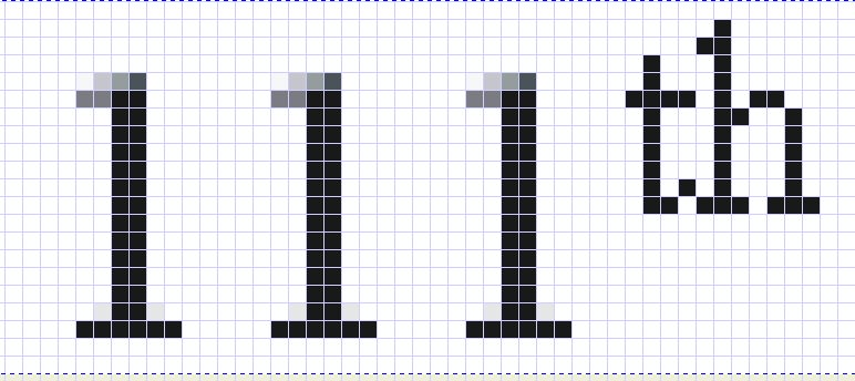
Next, take a look at a screen snapshot taken at a 55-point font, using "standard" smoothing. Note that the appearance of the top of the serifs of the "1" and the following "t" are quite different than the 12-point font rendering. If you don't see all the grid lines, in this 1600% magnification, that is an artifact of the quantization when I reduce the image so it fits on the screen for this Web page. You can probably look at the original GIF file that is attached to this Web page, expand it, and see all the grid lines.
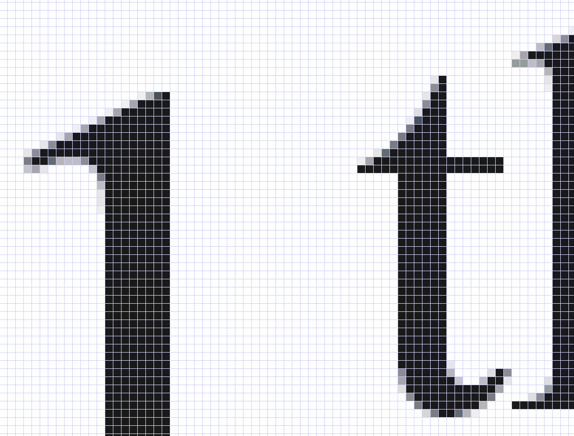
Finally, let's take a look at the scanned 12-point font printer image.
I scanned the printer image slightly differently for this experiment. It was done at 2400dpi optical. It was also done as a 24-bit color scan (as all my scans have been), converted to an 8-bit GIF image, and pasted into this document.
The image was created as follows. I first scanned in the "111th" at 2400dpi (it was printed at 1200dpi, so this is just at the Nyquist Limit). I then expanded the image until I saw only a piece of the image; the best I could do that still fit on the screen was 500%. Then I did a "print screen" operation to capture the display, pasted it back into Corel PhotoPaint, selected the area I wanted, copied it out and pasted it back. The result is shown below. Note the pixels are much smaller and there are more of them. So we arrive at the conclusion that any attempt to compare a screen font to a printer font is meaningless. Not only are the resolutions different, the ways the edge effects are handled by the rendering engines are different, and even selectable for screen fonts.
The color effects seen in the edges in image below are artifacts of the scanning process. The original is pure black and white. These edge effects are fairly small, and appear to have no effect on the overall impression of the font for purposes of comparison.
Note that none of these images comes even close to a scanned printer image, so any assertions about the meaning of a screen snapshot when compared to the CBS documents is without merit. Any conclusion arrived by using the screen fonts to compare to printer output is invalid. This invalidity is emphasized when we look closely and see the relative offsets of the top of the "t" and the top of the "1".
If anyone is wondering why I scan at 600dpi (half the resolution of what I use for printing), the answer is a simple engineering answer. I want images that can download in reasonable time, and which emphasize a point. Were I doing a more serious study, I would use 2400dpi (the highest optical scan my scanner can do), but each doubling of the dpi requires four times the image space in the raw image. While GIF-style compression does reduce the size of the image, it still has to be rendered, and take up memory space, in the recipients machine. A 2400dpi image, being four times the resolution of a 600dpi image, requires 16 times the space when displayed. Images at 600dpi, when displayed in the normal size of images in these reports, convey no more information than the higher-resolution images, and are easier to deal with.
If I had to produce more precise evidence, such as an expert witness, I would have to have photomicrographs, not done with a digital camera but with an actual film camera, so that the accidents of pixelization could be factored out. But even at low-grade pixelization, the case that the documents came from Microsoft Word are compelling, and finer resolution will not produce more meaningful results. And the debunking of Hailey's deeply flawed attempts at a study do not require high precision, either.
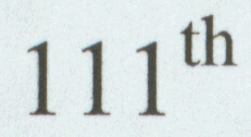 |
Here is "111th" printed at 1200dpi
and scanned at 2400dpi.
|
 |
I then scanned the same 1200dpi printed image at 200dpi and got this image |
 |
I then printed the 200dpi scan out at 1200dpi
and scanned the result back in at 150dpi (it turns out that the default size
set on my scanner is 72, 100, 150, 300, 600, 1200 and 2400, but I was able
to type 200 in and get a better quality scan than 150 gave me. But it
suggests that the document was probably faxed and scanned, rather than
having been received directly electronically, one of the options I posed for
the fax receipt by CBS. This is speculation, but I am working on that basis
and trying to see what happens).
Note how much detail is lost. Because my scanner is not the same as a fax machine, it has different qualities of grayscale level resolution than a fax machine. But it is worth observing that two levels of scanning, at different resolutions, results in significant modifications to the appearance of the characters. A scanner does a much better job of detecting multiple grayscale levels. |
 |
Just for amusement, I applied a JPEG compression to the image. The options were to use the "Optimize" encoding method, standard 4:2:2, with compression set to 22 and smoothing set to 0. The result is a bit worse, but I did this only to show that if some form of compression had been applied, additional artifacts could be introduced. |
Ultimately, we will probably never be able to determine how many transformations the documents went through. But what we see in the actual documents is severely distorted by pixelization, as I have amply illustrated earlier in this document. The pixelization is such that many of Hailey's assertions about wear, stem widths and crossbar thicknesses, and the like are simply not supported by the evidence at hand. And he makes these assertions without demonstrating what characters he uses for the actual basis of his assertions.
In re-reading Hailey's document (I will be presenting a talk within the next month, and his work is almost a textbook case on how to do bad science, so I was looking for good, unsubstantiated, quotes to present, and the misleading analysis that makes the results nonsensical) I noticed that he claimed, in my copy of his document, that the subscript increases the overall maximum height of the line by "20.04%". This is based on his comparison of the Bush Guard memo to the screen image (already a methodological catastrophe). This is an absolutely fascinating degree of accuracy. 20.04%. That means that it is not 20.05%, or 20.03%. It is exactly 20.04%. He is claiming accuracy to one part in 10,000. Unlike a serious scientific study, which would have given an error bound by measuring a number of superscripts, and measuring each one several times, and computing the mean, standard deviation, and probable error of each of the individual measurements and the overall set of measurements, and giving the computed result, he measured exactly one sample, apparently once, and a very precise number is presented. We know from pixelization that we could expect an error of ±1 pixel on any given quantization, or on the average, assuming a uniform distribution, ±½ pixel across all instances. Having measured the pixelization of one of the memos at 150dpi, we can expect that the best we can tell, on the average, about any edge is 1/300th of an inch, in the best case, assuming that the scanned image was not itself already quantized. This means that the best we can tell is 1 part in 300, or approximately 3 parts in 1000, that is, 0.3%. A 12-point type font, printed at 1200dpi, would be 12/72 of an inch high, or it would be occupying 200 pixels (12/72= 1/6). An error of ±½ pixel in a 200-pixel-high character would mean that a given character might exhibit a half-pixel error, or 1 part in 400, or 0.25%. This assumes that the measurements could be made that accurately. His Figure 3a shows horizontal lines that don't even extend to the character he claims to be measuring from, are themselves many pixels thick, and are, upon close inspection with a pocket 10x magnifier, attempting to match edges whose certainty is substantially less than 1 part in 10,000. How one can get accuracy to 1 part in 10,000 even if the image were printed at 2400 dpi is questionable; to get this degree of accuracy, the images would have to be printed at 20,000 dots across the height of the characters being measured, based on the Nyquist-Shannon Sampling Theorem. Given that a 12-point font is 200 pixels at 1200dpi, he would need 20,000 pixels or 100 times the number of pixels actually available on a 1200dpi printer, that is, he would need a printer capable of depositing 120,000dpi to get that accuracy. And this could only be derived if the other image was also available at the same incredible resolution. Yet Hailey claims an accuracy of 0.01%, which is unsupportable by the physical evidence. His accuracy is at least an order of magnitude greater than the quantization of the measurements could support. It is not clear how he can make such a claim. It indicates a deep misunderstanding of how to perform elementary measurement experiments and analyze the results. That is, the sort of techniques that are mandatory in a sophomore college physics course, the sort of techniques I learned at age 17.
He further claims in his illustration that the "cross stroke of the "t" in the Times New Roman superscript is approximately [emphasis added] ten points below the top of the "1"". Given the purpose of the measurements is to compare a Times New Roman 12-point font, ten points would place the crossbar of the "t" just slightly above the baseline. He then claims "The cross stroke of the Bush Memo "t" is ten points above the top of the 1". Note the absence of the word "approximately". In a 12-point font, how can there be an error of 20 points between two images? Perhaps if he had actually described his experiment in a meaningful fashion, and conducted a meaningful experiment in the first place, and described his means of measurement, and worked out the level of experimental error on a set of measurements, he might have had some hope of credibility here, but given the experiment is so poorly described, even if it had been correct, the results he claims would be impossible to justify.
 In
an image of the low resolution of the Bush memo (perhaps 150dpi if my estimate
is correct), he claims he can identify the crossbar of the "t" to within a range
of no more than ±½ point, that is, in a 12-point font, to within 1/144
of an inch, or just about 1 pixel at 150dpi. Shown to the left is the actual "th",
extracted from the TIFF file of the 04-May-1972 CBS document. It is unclear
which of the 11 pixels actually represents the horizontal bar of the "t". So he
compounds a fundamental methodological error with a pretentious claim of
accuracy which cannot be substantiated by any of the physical evidence. Yet he
asks us to accept his claim of "20.04%" as if he had actually made a measurement
that accurately. This is extremely poor science. Using techniques this
poor he would have failed any introductory physics course.
In
an image of the low resolution of the Bush memo (perhaps 150dpi if my estimate
is correct), he claims he can identify the crossbar of the "t" to within a range
of no more than ±½ point, that is, in a 12-point font, to within 1/144
of an inch, or just about 1 pixel at 150dpi. Shown to the left is the actual "th",
extracted from the TIFF file of the 04-May-1972 CBS document. It is unclear
which of the 11 pixels actually represents the horizontal bar of the "t". So he
compounds a fundamental methodological error with a pretentious claim of
accuracy which cannot be substantiated by any of the physical evidence. Yet he
asks us to accept his claim of "20.04%" as if he had actually made a measurement
that accurately. This is extremely poor science. Using techniques this
poor he would have failed any introductory physics course.
Oh yes, given that he was apparently making this measurement on a screen font, the claimed accuracy is equally nonsensical. Most displays run between 90dpi and 100dpi, with 96dpi being a common resolution. On a 12-point font, 1/6 of an inch would therefore occupy between 15 and 17 pixels. Therefore, the best he could hope for is 1 part in 15 to 1 part in 17, or an accuracy of between 5.8% and 6.6%, so he is quoting an accuracy more than two orders of magnitude than could be derived from examining the correct sized font example from a screen image. To get 1 part in 10,000 accuracy, a screen font 20,000 pixels in height would have to be used. At 96dpi, this would require a screen 208" high to display the character. He would then be measuring it against an image whose pixelization, at the same scale, would be the result of taking a 1/6" image at 150dpi, or 25 pixels, and stretching it to 20,000 pixels for comparison; this means that every pixel in the original of the CBS memo would be stretched by a factor of 800 (20,000/25 = 800). So which of the average 400 pixels represents the accurate placement of the Bush Memo character?
Please feel free to quote this material, use any of my images, etc. if you are reposting. I do ask that you provide a link to this page.